TAPAS.network | 8 January 2026 | Commentary | Graham James
The new DfT connectivity metrics: What do they do, and how can we use them?

Transport planners are hoping that a high profile public launch with ministerial backing for the rollout of the Department for Transport’s new Connectivity Tool will embed more sustainable travel planning into new developments. In the first of three articles about the tool and the associated metrics it can offer, describes the underpinnings of the connectivity concept, its strengths and limitations, and what it can best be used for. Subsequent articles will home-in on some technical aspects of the tool and what the results from its metrics really tell us.
RECENT ANNOUNCEMENTS from the Department for Transport (DfT) and the Ministry of Housing, Communities and Local Government (MHCLG) have promoted the DfT’s new online Connectivity Tool as having a potentially significant impact on a range of transport- and planning-related decision-making (LTT 928).
Under the headline “Mapping opportunity: new Connectivity Tool launches to place sustainable transport at the heart of jobs, schools and vital services,” the DfT’s December announcement1 of the tool’s release described it as “a new clear way of measuring what is a ‘sustainable location’ for development around transport projects”.
The tool is the front-end for an ambitious set of connectivity metrics that DfT has been developing. There is a long-standing policy aim, set out in the National Planning Policy Framework (NPPF) and elsewhere, to focus development on locations which offer sustainable travel patterns, within the overall goal of sustainable development. But, DfT said, “progress has been hindered by the lack of a clear way of measuring what a sustainable location in transport terms is.”
The announcement continued with a statement from Minister for Local Transport Lillian Greenwood. “By making the tool widely available, we are setting a new national standard for measuring connectivity and supporting sustainable growth across England and Wales,” the Minister said. “Transport is central to unlocking growth. The Connectivity Tool gives planners and professionals the evidence they need to make better decisions about where development should happen, ensuring communities are well connected to jobs and services.”
A few days later, MHCLG published a consultation draft version of its revised NPPF2. The new version says – twice – that the Connectivity Tool should be used, alongside other evidence, to inform the selection and assessment of sites for development3. Indeed DfT’s earlier announcement had pointed out that the tool was already being used to support the work on creating new towns, “helping to understand the opportunities to make them accessible, well-connected and sustainable”.
The full Connectivity Tool is now being made available, free of charge, to planners and built-environment professionals, reaching beyond central and local government officials to whom it has already been available for some months. Another version, the “Connectivity Tool Lite”, is freely accessible online for wider public use, “allowing communities to explore connectivity in their area and understand how transport links support access to other services.”
The talk is ambitious, and a lot of store is being set by what can now be achieved compared with what went before. So it’s worth taking a more detailed look at the tools and the underlying ‘connectivity scores’ they show. What do the scores actually measure? Are the outputs robust and reliable? Can the tools make a real difference, ensuring places are easily accessible by walking, cycling and public transport as well as by car? And does the computer now provide all the answers we need?
What are connectivity metrics about?
Over the years transport has spawned a number of different conceptual ideas relating to what individual modes and networks offer in terms of ‘service’. The idea of connectivity embraces not just the transport network itself, but the specifics of what people want their transport to link them to.
Connectivity is essentially about how well-connected places (and therefore people who live there) are in terms of getting to other locations and activities. Depending on the context, this might be about connections within the place, to the transport network, to other places, or to particular facilities and services. But the common theme is that it’s about what it is possible to do – opportunity – rather than counting or forecasting what people actually do in terms of numbers of trips.
Travel-time (‘isochrone’) mapping is a common, simple way of assessing connectivity: where can you get to, from a given origin, within a given amount of time. Catchment analysis asks the opposite question: for example, how many people live within a given travel time from your site?
More complicated metrics can ‘score’ places, using multiple factors around what you can get to (the destinations or attractions), the ease of getting there (travel time and cost), or both. Connectivity by different modes of transport can be measured, and places can be compared with each other.
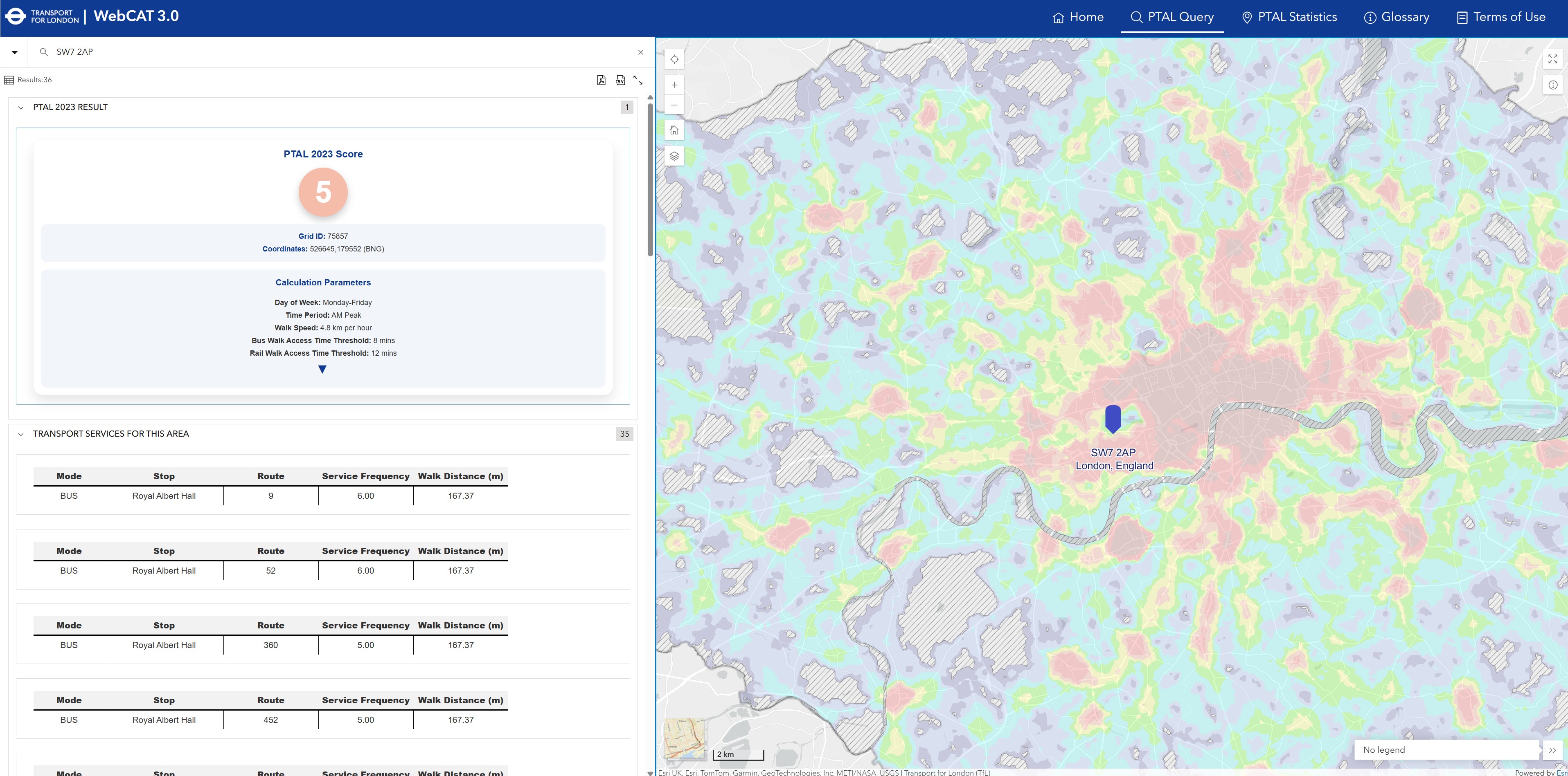
Perhaps the best-known of these is the Public Transport Access Level (PTAL)4, which started in London for deployment by Transport for London and the boroughs to assess planning decisions (Figure 1) but is now also used elsewhere5. PTAL measures access to the transport network – but not access to destinations.
And recently, with the popularisation of the ‘15-minute cities’ idea, online tools have been developed to show how well places meet this goal. These too are connectivity metrics, reflecting both destinations and transport.
Figure 1: The Public Transport Access Level (PTAL) is perhaps the best-known connectivity metric
The DfT’s new metrics
The new connectivity metrics which underpin the DfT tools combine transport and land-use data into connectivity scores for every location in England and Wales. DfT says the metrics aim to be holistic, accounting for a wide range of destinations, their differing importance, a range of transport modes, and the travel times involved.
The impetus, DfT says, came from the Treasury, who wanted a measure to help understand how well-connected different parts of the country were, and help gauge the connectivity impacts of investments6. DfT also sees potential to measure progress over time, and to support planning decisions as described above.
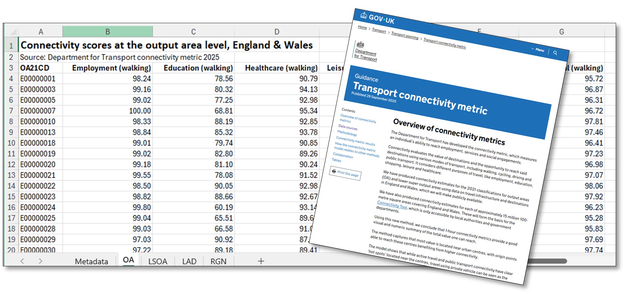
The initial dataset, and explanatory guidance, were first published in September 20257 (Figure 2). This first release is seen as experimental, and DfT is seeking feedback to improve both the methodology and test practical application. Following any tweaks, annual updates are planned. The existing journey time statistical series8, published from 2014 to 2019 by DfT, will no longer be produced, but DfT is instead looking to extract journey time estimates from the process that creates the connectivity metrics.
Figure 2: DfT has published the connectivity metric dataset and explanatory guidance
How do the metrics work?
The metrics are calculated for two different sets of origins: the published dataset uses census output areas (all 188,880 of them), and the online tools use a 100 metre grid of points.
Either way, they essentially ask “how much useful stuff can you get to, from here, within an hour’s travel?” Individual metrics drill down into six different journey purposes, looking at four different modes of travel for each. These are then amalgamated (weighting by purpose and mode using national-level data from the National Travel Survey (NTS)) to give overall scores for each purpose and for each mode, and a final ‘overall (except driving)’ score that is a weighted average of the walking, cycling and public transport scores9 (Figure 3).
Figure 3: The metrics offer 35 scores to choose from
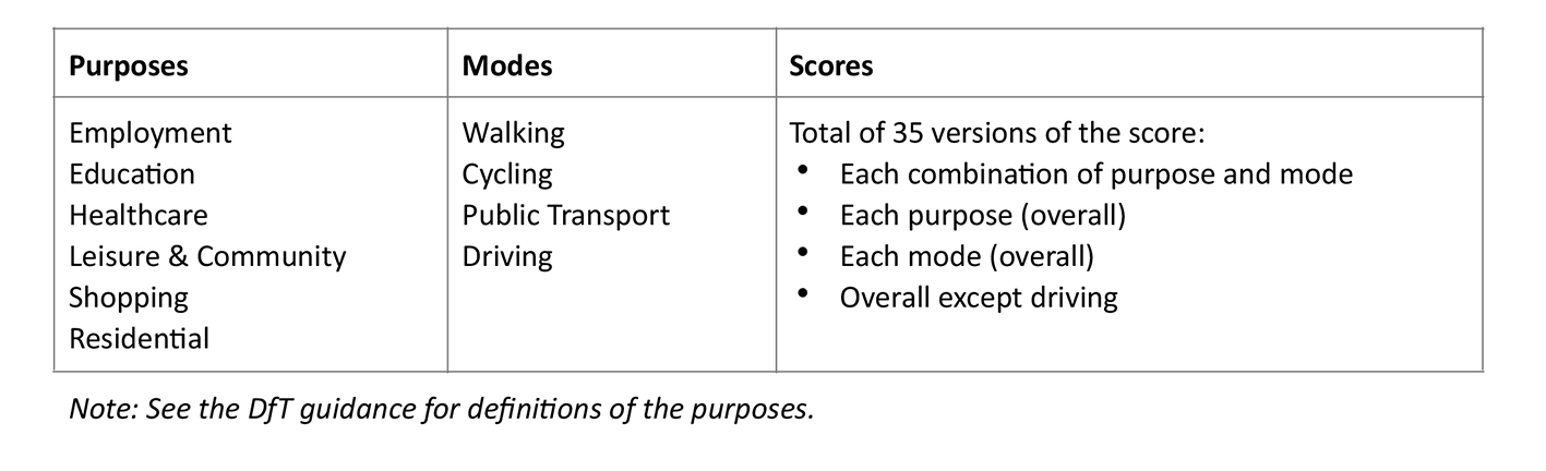
The ‘employment’ purpose is essentially access to job opportunities. ‘Residential’ represents social trips to visit friends in their homes. The other four journey purposes cover education, healthcare, shopping, and leisure and community facilities.
The four modes of transport are walking, cycling, public transport and driving. DfT has used existing datasets for the corresponding networks and journey times (Figure 4).
Figure 4: The network datasets for each of the four modes considered
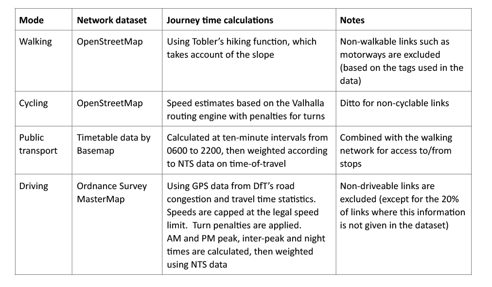
Source: DfT, Transport Connectivity Metric, 29 September 2025, https://www.gov.uk/government/publications/transport-connectivity-metric/transport-connectivity-metric. It is not immediately clear which days of the week are covered in the driving and public transport calculations.
The metrics are not simply a counting process. They weight different types of destination (attractions) according to their importance in travel patterns. They also weight destinations closer to the origin more heavily than those further away (an ‘impedance function’ in technical terms). And they recognise the diminishing returns from having multiple destinations of the same type: for example, once you can get easily to (say) three supermarkets, there’s little extra value in having a fourth or fifth available10. So with each extra destination of a particular type that you can reach, the connectivity score increases, but not by as much as it did for the one before.
The results for each metric are then scaled. The best-connected location on that metric gets a score of 100 and the others are scaled relative to that. For example, a score of 50 represents half as much connectivity as that of the best. Hence the metrics show relative rather than absolute connectivity.
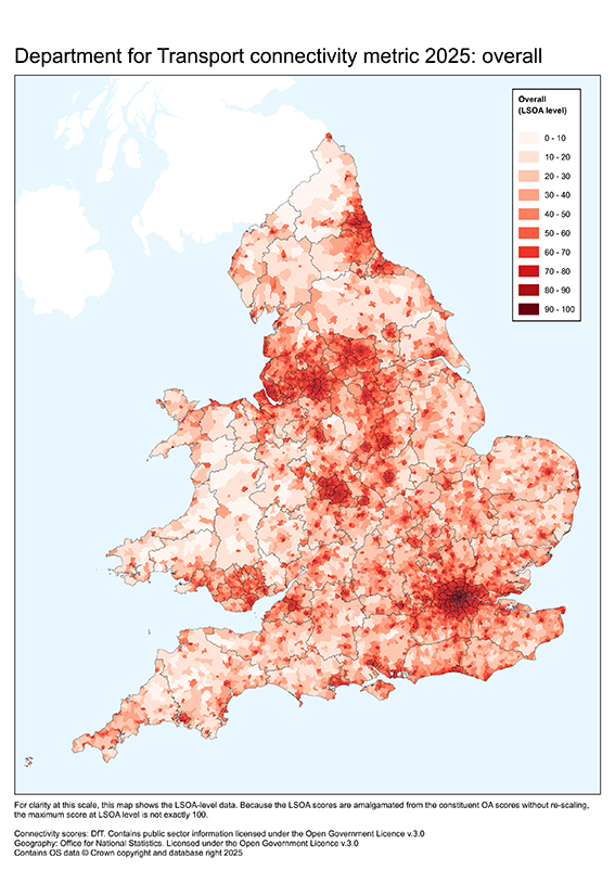
Finally, the scaled scores for the output areas (OAs) are successively amalgamated to produce scores for lower super output areas (LSOAs) (Figure 5), local authority districts, and English regions or Wales.
Figure 5: The overall (except driving) scores at LSOA level
The online tools
As already mentioned, DfT has produced two accompanying online tools.
The Connectivity Tool Lite11 is a free-to-use map-based data viewer, available to anyone (Figure 6).
The full Connectivity Tool12 additionally lets users play ‘what-if’. You can try alternative weightings of modes and purposes, or plot a new public transport route and see the impact on an area’s connectivity scores. The idea of the latter, DfT says, is to help identify necessary transport interventions. But this tool is only available to “built environment professionals in the public or private sector”, on request to DfT. At the time of writing, DfT had not granted my company access, so I can’t comment on it in detail.
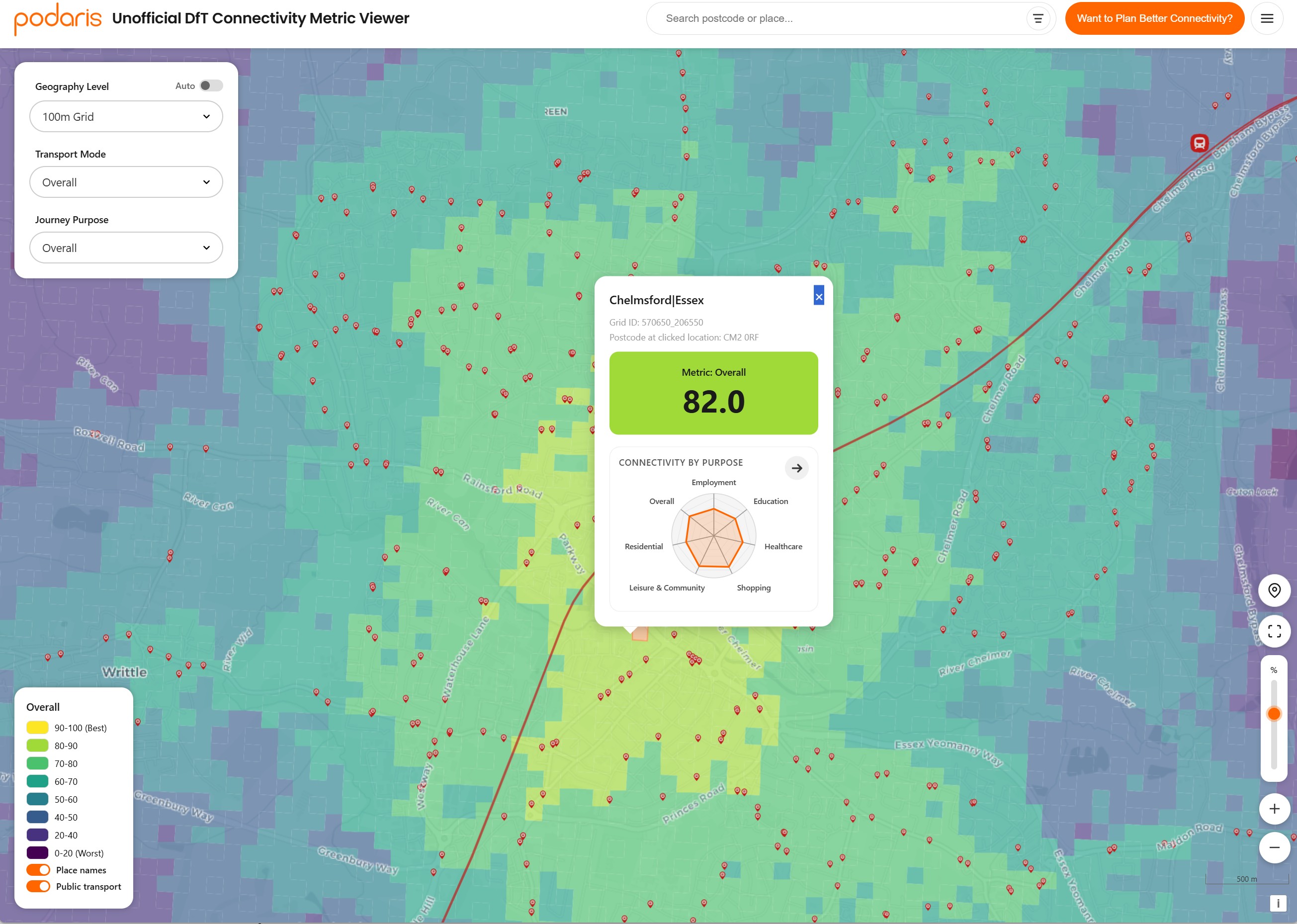
Finally, the software company Podaris has also created its own free-to-use – and pleasantly addictive – online viewer13, covering both the OA-based and grid-based geographies (Figure 7).
Figure 6: The Connectivity Tool Lite is a free-to-use map-based viewer for the connectivity metrics
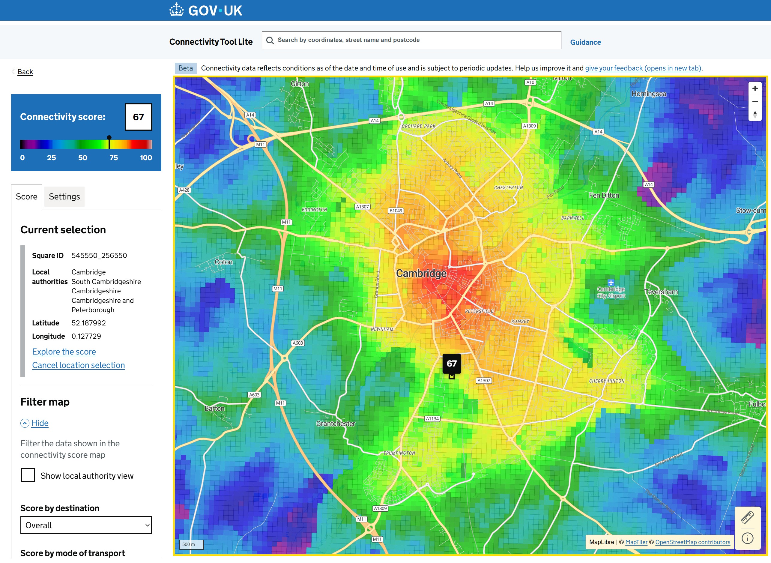
Figure 7: Podaris has also created a free-to-use viewer for the data
Lots to like
DfT has assembled a well-rounded, but not yet perfect, set of connectivity metrics. It is nationally-consistent and high-resolution. Although modern datasets such as OpenStreetMap can short-cut the data collection, and computers handle the calculation burden, a lot of thinking and domain knowledge is still required to produce credible results. These metrics are an impressive effort.
The results are intuitively credible, at least as a ‘big picture’. Across the metrics, the basic pattern of more- or less-connected areas is broadly what you would expect, both at national level and more locally (see Figure 8 for an example of how it compares with PTAL for London data). There has naturally been social media discussion over some of the detail, which I will consider in a subsequent article.
The technical approach has some valuable features. The use of travel time impedance functions is particularly welcome. The hard cut-offs in the isochrone approach have always been a limitation: real life isn’t binary like that.
Reflecting diminishing returns from duplicate destinations is also welcome. Again, access is not a binary issue. Although being able to get to a GP, optician, corner shop or school (for example) is basic connectivity, there is social and economic value in having more than one to choose from, so a simple ‘can you get to one?’ method is not fully-rounded. But a ‘count how many’ approach would not reflect the diminishing returns as each new option is added.
Finally, the representation of social trips to visit friends at home is good to see. This is not often at the forefront of transport planning, and is a declining aspect of travel14. But it is perhaps an under-appreciated part of connectivity, particularly in relation to social isolation and its impacts on health and wellbeing.
Figure 8: London: DfT connectivity metric compared to PTAL
The limitations
The downside of the data-intensive, processing-intensive approach is the difficulty of getting under the bonnet to see the calculations in action. It will be hard for users to reproduce the method, test the sensitivity to alternative data sources or parameter choices, or test refinements. Doing so relies on what the DfT tool offers, or the daunting task of reverse-engineering the method.
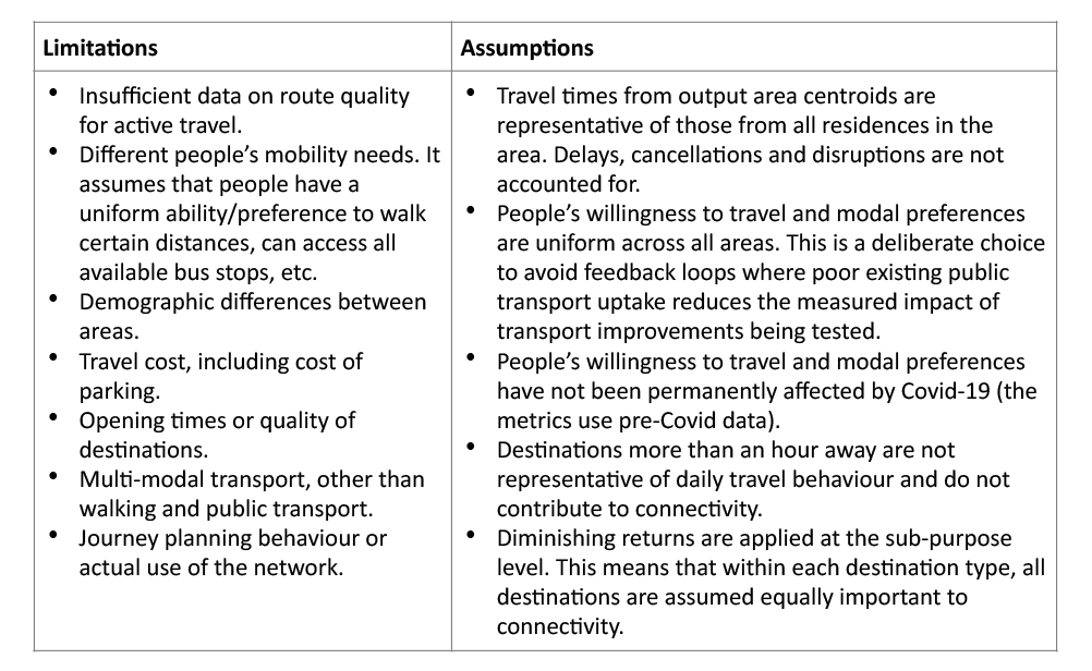
The accompanying guidance includes a list of limitations and assumptions (Figure 9), some of which may be addressed in future releases. In the space available, I can only pick out a handful to discuss.
First, the cost of travel is not included. Usually this will roughly scale with the travel time and can be ‘taken as read’, but in some locations bridge tolls, ferry fares and parking costs will reduce the effective connectivity. I’d like to see, for example, how the connectivity scores for the Isle of Wight are affected when ferry fares across the Solent are included. And for driving in busy city centres, parking may be a significant cost or may involve spending time circulating to find a space. I’ll come back to this in a later article when I look at some of the scores.
Second, different people’s mobility needs are not taken into account. In effect the metric is based on a uniform population. I would welcome development of a ‘step-free transport’ version of the metrics to illustrate this and measure progress over time. DfT has said this is a possibility.
Some other factors might change things at the margin, and might be significant in particular places (and hence significant if we want to use the metrics as a policy tool or as evidence for investment decisions in those places). Route quality is not taken into account and although the method excludes walking and cycling from motorways and dual carriageways without footways, in practice this leaves some links included which are unattractive to walk or cycle on. It would be good to understand the sensitivity to different assumptions or parameters in this respect.
The only multi-modal transport considered is walking to and from a public transport stop, so park-and-ride options are not taken into account. Journey time reliability (and hence the extra travel time people allow to guard against disruption) isn’t captured. I would add that interchange and wait-time penalties on public transport – the ‘hassle factor’ of making an interchange or waiting at a stop, over and above the actual time involved – don’t seem to feature either.
Finally, any destination more than 60 minutes away doesn’t count towards these metrics. Some people do commute for more than an hour15, and (as revealed by that behaviour) the job must be more valuable or available to them than the alternatives within 60 minutes. But the impedance penalty would de-weight these long trips anyway.
Figure 9: DfT’s stated limitations and assumptions for the connectivity metric
Source: Adapted from DfT, Transport Connectivity Metric, 29 September 2025, https://www.gov.uk/government/publications/transport-connectivity-metric/transport-connectivity-metric
Some technical factors
DfT’s decision to scale the metrics out of 100 has some benefits. The scale is intuitive and makes it easy to say “our connectivity is X% of the best”. And it allows a degree of comparison across indicators, without allowing the mistake of doing so via the raw scores that aren’t comparable16.
But you can’t directly use the scores to say “what is good? And is our area good?” You can, however, benchmark against other locations that you consider (from your own knowledge) to be ‘good’. And you can’t track absolute changes over time17, so the metrics’ value as a policy monitoring tool is limited unless the 100 score in 2025 is treated as the starting-point for a time-series index.
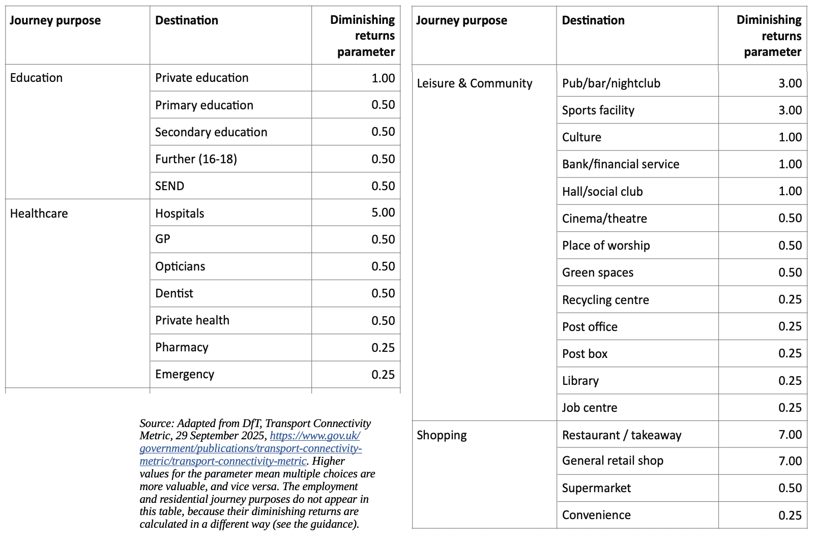
The diminishing returns parameters for facilities and services might generate lively discussion. The exact formulas are not clear in the guidance, but each type of destination has a ‘scaling factor’ parameter between 7 (slowest-diminishing, meaning multiple choices are most valuable) and 0.25 (the opposite). DfT says these were determined through internal research and validated through engagement with local authorities. Figure 10 is the full list.
For example, restaurants/takeaways and general retail shops get the top level of 7, with hospitals next on 5. At the opposite end of the scale, postboxes are on 0.25: one postbox gives pretty much the same service as another. But so are libraries and pharmacies; I’m not convinced, as different libraries have facilities and value of their own, and there’s value in having consumer choice of pharmacies.
Between these extremes, a choice of pubs, bars and nightclubs (on 3) is apparently more valuable than a choice of green spaces (0.5), banks (1) or cultural facilities (1). I suppose we like our pints – and pubs do have their individual vibes and tribes. But it would be nice to see the evidence behind the parameters, or at least to test whether alternative weightings would make a material difference.
Figure 10: The diminishing returns parameters for facilities and services
What can we use the metrics for?
Do the metrics show how good the connectivity is in different places? Yes, at least on a relative basis.
Can we compare connectivity by modes or purposes? Yes, but only relatively across locations. We can’t make absolute comparisons within a single location, because each metric is scaled individually. For example, if a location’s driving and public transport scores are both 80, that does not mean it has the same connectivity by each mode – only that it is 80% of the best for each.
Do they show where connectivity is or isn’t good enough? Not on their own. We would need to decide for ourselves what ‘good enough’ looks like (perhaps by identifying a ‘good’ location as a benchmark); whether that should vary between, say, urban and rural areas; and whether over-performing on one aspect of connectivity can make up for under-performing on another. And even with technical thought, these are ultimately questions for policy and judgment.
Do they tell us what connectivity is like for individuals? Only for a theoretical average person with access to the mode(s) in question. As I’ve mentioned, metrics for people with restricted mobility would be valuable. And because car availability is a critical determinant of individual travel patterns, I would also like to see ‘car available’ and ‘car not available’ metrics. The existing ‘overall (except driving)’ and ‘driving’ metrics don’t quite do this, although they may not be a bad proxy in many cases18. The ratio of the two would also show what difference a car makes in each area19. I’ll come back to this one too.
Do they tell us how good or bad the transport system is? Sort-of. They are about both transport and destinations, and reflect land-use patterns just as much as the transport system. This is, of course, the whole point. And the value of a transport system lies in where it goes.
Can we test improvements to the transport system? With the full tool, you can add new public transport routes and see the impact on the connectivity scores. DfT is hoping to allow this for active travel improvements too. However, as the scores are relative, the results are a little abstract. It may be easiest in practice to use the scores as benchmarking – for example, to show how an intervention would bring the target area’s connectivity up to the same level as another area that is seen as already ‘good’.
Can we test the connectivity of proposed new developments? No, but DfT says this is also potential functionality. Even so, setting-up a test might be considerable work. The metric needs to know or assume all the ‘destination’ elements of the development – not just the houses and jobs but also the doctor’s surgery, coffee shops and so on – as well as its transport network. The test would ideally also need to reflect the impact on link speeds in the surrounding network – essentially traffic modelling to feed into a do-something version of the connectivity dataset. But if it can be done, it could be instructive.
Do they tell us how people will travel – for example in those new developments? No. Connectivity is about what people can do, not what they will do or would consider doing. For example, a development might be within easy cycling distance of things – and have a good cycling connectivity score – but that’s for nothing if most residents wouldn’t think of getting on a bike and would default to their cars for local trips. Placing a new development or a whole New Town in a well-connected location isn’t a free pass to sustainable outcomes.
Can we test changes to the locations of public services? Possibly. Again this requires functionality in the tool, or reverse-engineering an equivalent. Even then, the results will be quite abstract, and perhaps risk bringing Goodhart’s Law into play. I suspect that existing service-specific metrics and techniques will remain the most fruitful.
Can we monitor changes in connectivity over time? Once the methodology is settled, DfT intends to routinely update the statistics. But as mentioned above, a meaningful time-series will require either use of the raw (unscaled) scores or an ‘index’ approach, rather than scaling each year in its own right. DfT is using the connectivity scores for two of its new core metrics (LTT 920), so will need to do this anyway.
Can we build our own tools to create an extended or amended version of the metric, test different assumptions, or play ‘what-if’? Not really, for now. The basic approach has been set out in the guidance, but perhaps not in enough detail for the calculations and parameters to be reproduced exactly (like we can for PTAL). Perhaps someone will take the plunge and try to reverse-engineer the method. But it would be most helpful if DfT could open-up the code.
Can we mash it with other datasets? Absolutely. More on this in my follow-up article.
Conclusions
We now have, perhaps for the first time, an easily-available, well-rounded, high-resolution set of connectivity metrics for the whole of England and Wales, that take into account all the main factors (destinations and their diminishing returns, transport and its impedance). This is a major step forward, and DfT deserves credit for an enormous effort.
There is still work to do. The main limitations will need addressing. DfT could usefully offer more to show that the technical choices made (such as the diminishing returns parameters or the 60-minute cut-off) are well-founded. But I suspect that in most places, for most purposes, it’s a reasonable measure. Besides, like any tool or model, users are well-advised to know its limitations and to apply professional judgment when the method doesn’t tell the full story.
For practical usability, an unscaled or indexed version of the metrics would be helpful, so that changes can be tracked over time in order to monitor outcomes. ‘Car available’ and ‘non-car-available’ metrics would help to better understand the impact of this key segmentation. And there is an opportunity to extend the metrics to examine where and how the transport system is the limit to taking advantage of the available destinations – or vice versa. This too could be valuable for policy-making and scheme prioritisation.
Best of all would be to open up the workings, so that practitioners can themselves have a go at these and other refinements. But in the meantime, the dataset opens up a range of analyses for us to experiment with.
Acknowledgements
Map data sources: Department for Transport, Office for National Statistics, Ordnance Survey, Transport for London. Contains public sector information licensed under the Open Government Licence v3.0. OS data © Crown copyright and database right 2025
Thanks to Tim Gent for helpful discussions and ideas during the development of this commentary. All opinions expressed are nevertheless the author’s own.
Some further details of the software development
Under development withing the DfT for a decade, a trial version of the new Connectivity tool was launched in June for local authority officers to test and give feedback.
DfT explains it undertook the Alpha phase of development of the tool, and then brought in Triad, the UK-based digital data, and technology consultancy (with input from DfT), to take the service to Public Beta under a £1m contract which began in January 2024.
LTT has reported that a £4m contract is being let by DfT to now outsource the Connectivity Tool’s management, support and further development though it is not clear if this will be Triad.
The service had been developed using the Svelte framework with a combination of MapLibre and PMTiles for the mapping services. It is deployed as a docker image with GCP’s Cloud Run service, and interacts with backend Cloud Run hosted Rust/Python APIs to perform more complex services.
References and Links
-
https://assets.publishing.service.gov.uk/media/6941965758a21370f58f304e/Draft_NPPF_December_2025.pdf. See Policies TR1 and TR3.
-
The headline-grabbing new provision for development around well-connected railway stations in the green belt (in Policy GB7) has nevertheless bypassed the tool, with its own separate definition of what ‘well-connected’ means
-
Greater Manchester uses a modified version, called Greater Manchester Accessibility Levels (GMAL). See https://www.data.gov.uk/dataset/d9dfbf0a-3cd7-4b12-a39f-0ec717423ee4/gm-accessibility-levels
-
DfT presentation at the Transport Analysis Guidance conference (aka ‘TAGfest’) in June 2025.
-
https://www.gov.uk/government/publications/transport-connectivity-metric. There is also a briefer version of the guidance at https://connectivity-tool-lite.dft.gov.uk/help/understand-the-data
-
https://www.gov.uk/government/collections/journey-time-statistics
-
The final metric in the published dataset is labelled as ‘overall’ but appears to be ‘overall (except driving)’. Its scores are consistent with applying the stated weightings to the walking, cycling and PT scores. This also applies to the discussion of the ‘overall’ scores in the accompanying guidance.
-
In technical language, this is diminishing marginal utility. See, for example, Metz, D. (2010), Saturation of demand for daily travel, Transport Reviews, 30(5), 659–674. https://www.tandfonline.com/doi/abs/10.1080/01441640903556361
-
In England, at least. See National Travel Survey table NTS0403, John Siraut’s analysis in LTT 925, and mine at https://grahamjames.co.uk/different-purposes-different-trends-what-the-latest-national-travel-survey-data-tell-us-about-post-covid-recovery-in-trip-making/. The equivalent data for Scotland do not have a directly equivalent journey purpose, and there are currently no equivalent data for Wales. In Northern Ireland, this journey purpose was declining pre-Covid: see https://www.infrastructure-ni.gov.uk/publications/travel-survey-northern-ireland-tsni-depth-report-2021 Table 4.1.
-
See TSGB0111: Average time taken to travel to work by region of workplace and usual method of travel in Great Britain, 2023.
-
For example, saying “we score 625 points for access to shopping but only 325 for access to jobs” (or whatever) would not be fair, because the indicators are all measured in different ways. But saying “we’re at 80% of the best on shopping but only 60% of the best on jobs” (for example) would be fair. Relative performance can also be expressed in terms of percentile positions, as set out in https://connectivity-tool-lite.dft.gov.uk/help/interpreting-connectivity-scores.
-
Unless, by happy accident, the best-connected place never changes and never gets overtaken at the top of the list.
-
The ‘overall (except driving)’ metric is a weighted average of the individual non-car modes. A true ‘non car available’ measure would take a mode-agnostic look at what you can get to by any of the non-car modes. The ‘car available’ measure would be similar but with driving as an option.
-
This is not a new idea. See, for example, Derek Halden, David McGuigan, Andrew Nisbet and Alan McKinnon (2000), Accessibility: review of measuring techniques and their application, Report for the Scottish Executive Central Research Unit. https://dhc1.co.uk/content/access-review-of-measuring-techniques.pdf
Graham James is a Technical Director at the transport planning consultants Galle Saliman and Parking Perspectives. He studied geography and began his career on the policy and research staff of the London Regional Passengers Committee (now London TravelWatch), before moving into the consultancy sector. He is a Treasury-accredited Better Business Cases practitioner and he lectures in Transport Economics.
This article was first published in LTT magazine, LTT928, 8 January 2026.
You are currently viewing this page as TAPAS Taster user.
To read and make comments on this article you need to register for free as TAPAS Select user and log in.
Log in