TAPAS.network | 20 February 2024 | Commentary | John Dales
It’s a Wonder - Up-tight, everything’s alright on side street junctions

Why does provision for motorised traffic still seem to get far too much priority at the junctions between main roads and side streets, to the considerable detriment for pedestrians, wonders . He looks at the obvious benefits from toning down the over-designed highway engineering traditionally used, in favour of making life easier for those on foot or wheeling along the pavements when they reach these intimidating crossing points.
REGULAR READERS will know I like to make a song and dance about the transport issues that get me going, and I try to vary my repertoire of musical references. However, I have to admit this is the third time (in 201 LTT contributions) that I’ve nicked the title for my piece from a Stevie Wonder song. Indeed, as thousands of you were doubtless about to remind me, I actually used this very same song title Up-tight, Everything’s Alright to head the column I wrote in June 2016 (LTT699). I used it then for essentially the same reason I use it now; which is that it describes so well how best to improve the junctions of side streets with busier streets. So thanks Stevie, for getting the message spot on. But before I get into that topic in detail, let me first take a couple of steps back.
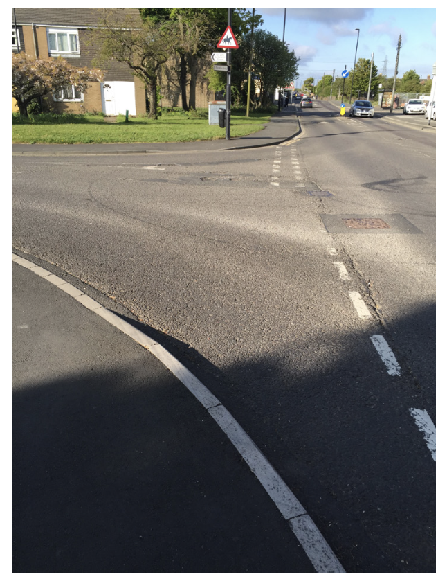
The photo that started it all, in my previous article in 2016. A hideously and unneccessarily wide ‘Bellmouth’ junction in North Tyneside.
Step one takes me to the motivation for the 2016 article. This was that, while on my annual, long walk to work that year, when I tweeted over a hundred photos of what I came across, along with a brief caption, the photo-tweet that attracted by far the most interest (an extraordinary amount of it, in fact) was of something extraordinarily mundane. Indeed, utterly commonplace. It was a ’standard’ junction between a main road and a side street. The photo in question was the one below.
The very fact of the scenario it showed being unremarkable was the reason I posted the photo, with my accompanying caption being: “There’s no need for this junction to be so far to cross: the ordinary, everyday indignity heaped upon people walking”. The specific location is unimportant because the sad fact is that, if you’re anywhere in any UK town or city, you will almost certainly come across a similar arrangement by just walking a modest distance in any direction on a main road.
I thought that the reaction to that tweet – several thousand people commenting on it, passing it on, ‘liking’ it, or simply looking at it – was quite remarkable. And I have to say that I was a good deal surprised by it. The experience ought, nevertheless, to have made me less surprised than I was about what follows next.

The solution’s in the song. Stevie Wonder put perfectly the approach that should be used for side street junction design - Up-tight, Eveything’s Alright
This is step two, which takes me back to just last month, when it was my privilege and, let it also be said, pleasure to chair a 90-minute webinar on the topic of Building Better Side Street Junctions. This event was something I’d suggested to the LTT Editor’s conference-organising colleagues at Landor Links towards the end of last year; and which I mistakenly thought would be something that only the nerdiest of street-geeks might be interested in. As it turned out, almost 1,200 people registered to participate – knowing that they’d therefore receive a link to the recording of the webinar, even if they couldn’t be there ‘live’.
On the day, however, a considerable number were indeed present and correct. Around 850 people watched the proceedings online as they happened, and my understanding is that these levels of interest were unprecedented for a Landor event of this type. If you didn’t attend at the time, or haven’t already watched the recording, then Deniz Huseyin wrote an excellent summary in the previous issue of LTT (LTT884, 23 January 2024), and you can see what transpired, in full, by visiting the webinar recording at https://youtu.be/wTI-dH-plFI
Both at the time and since, I’ve pondered why the humble side street junction should attract quite so much attention, and my conclusions, which may or may not be correct, are as follows.
Firstly, regarding the recent webinar itself, we had an excellent line-up of six speakers (not counting me), each of whom had something different that was really worth hearing concerning what does, can or should happen at side street junctions.
Secondly, and sticking with the webinar, there were two particular presentations about research into ‘simple zebras’ and ‘continuous footways’ that I imagine were of special interest, because they represent potentially exciting, yet straightforward, ways of dealing with a widespread and enduring problem.
Thirdly, though, and I think this is the big one, the simple fact of the inadequacies of so many side street junction layouts seems really to resonate with anyone who hasn’t become inured to the problem, due to it being hidden in plain sight.
I blame no-one if that’s what happened to them, mind. As is so often the case with problems with the walking environment, the majority of able-bodied people who can overcome the effects of poor layouts just do so, without much complaint, by stepping up or down at kerbs, and listening out for approaching traffic, and watching for the same, and running when the need arises. Thus, they have accommodated themselves to the challenges, perhaps with a shrug; as if there’s nothing really to do except just ‘get on with it’.
And it’s very much the walking (and wheeling) environment that I want to now talk about in this column. People on cycles also encounter danger at side street junctions, and I’m not playing that down. It’s simply not what I’m talking about on this occasion. If cycling conditions are your particular interest, then I hope that what I’ll say, in due course, about how side street junctions should change, will address many of your concerns, too.
I should also perhaps clarify that, when I referred above to “the inadequacies of so many side street junction layouts”, this was in relation to the experience of people attempting to walk, wheel or cycle across them. And the chief inadequacies to which I refer are largely the consequence of drivers of motor vehicles having been, frankly, pampered and spoiled at side street junctions. Which is to say that far too many such junctions are a great deal wider to cross, on the natural walking desire line across the mouth of the junction, than is necessary or desirable; and that this arises chiefly because the junctions have been designed to make turning into and out of them by motor vehicles as easy as possible. It’s because the radii of the corners are excessively generous that the width of the desire-line crossing is excessively great.
Some engineers and others insist that such layouts are necessary to enable the movement of large vehicles that have turning circles to match. I insist that, where the flows of such vehicles are low (e.g. a refuse vehicle every couple of days or a removals pantechnicon now and again), then we design around the needs of people walking, wheeling and cycling. There is no problem, in principle, with these large vehicles having to use the ‘other’ lane of the main carriageway in order to turn into or out of the side street.
The circumstance in which a typical, largely residential side street of a general width in the order of 6-9m suddenly expands to twice or three times that width (sometimes more!) at its mouth is what I have come to call the ‘Bellmouth Factor’. This creates a ‘double whammy’, where people crossing – whether walking, wheeling or cycling – are exposed to greater-than-necessary danger for longer than necessary.
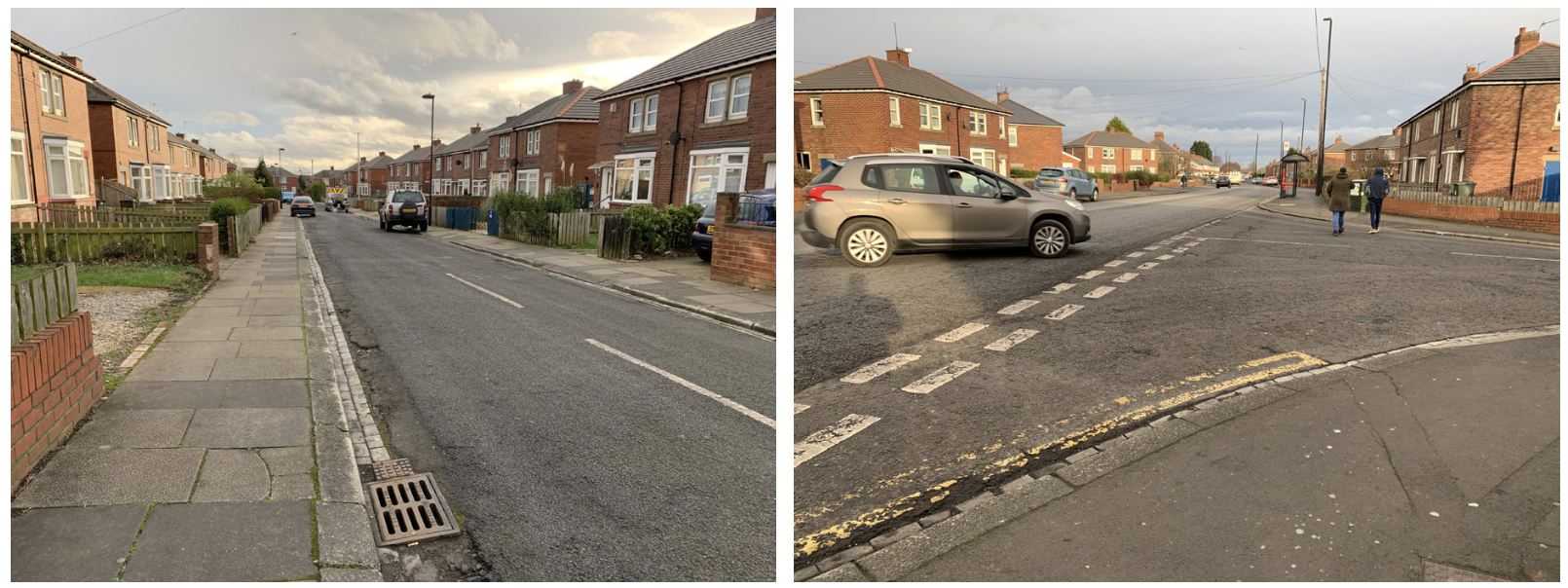
Two views of the same street in Wallsend, showing how even the narrowest of residential streets often balloon to dangerous and inconvenient proportions at their junctions with busier streets.
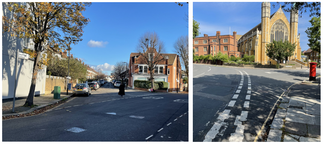
A couple more quite ludicrously and unnecessarily wide side street Bellmouths, both in residential areas not far from where I live in West London.
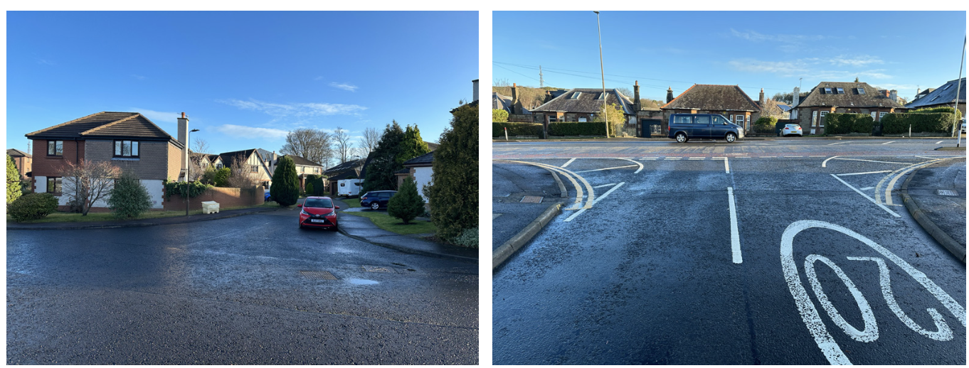
Above left: Even the tiniest of ‘side streets’ – this, a short cul-de-sac providing vehicular access for just five homes – can have Bellmouths that simply make no sense. That large refuse vehicles may need access simply doesn’t justify this kind of nonsense. Above right: Just 100m from the previous photo, hatch markings at a busier junction do an excellent job of showing where the kerb lines and pavement surface should really be.
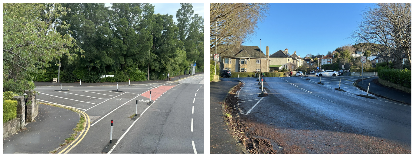
Two views of the same junction in Edinburgh, showing just how much excessive space there can be at what are simple and lightly-used junctions; and also showing how this space can be cheaply and effectively (if not beautifully) recaptured on behalf of people walking, wheeling and cycling.
Whatever else might be done to help people cross side street junctions more easily – and I’ll touch upon some of the options shortly – the basic geometrical failure represented by the Bellmouth Factor, the main causal factor of the ‘double whammy’, has to be addressed. Excessive junction radii are at the heart of the side street junction problem. Much tighter radii and everything would be much better. One might almost say ‘alright’.
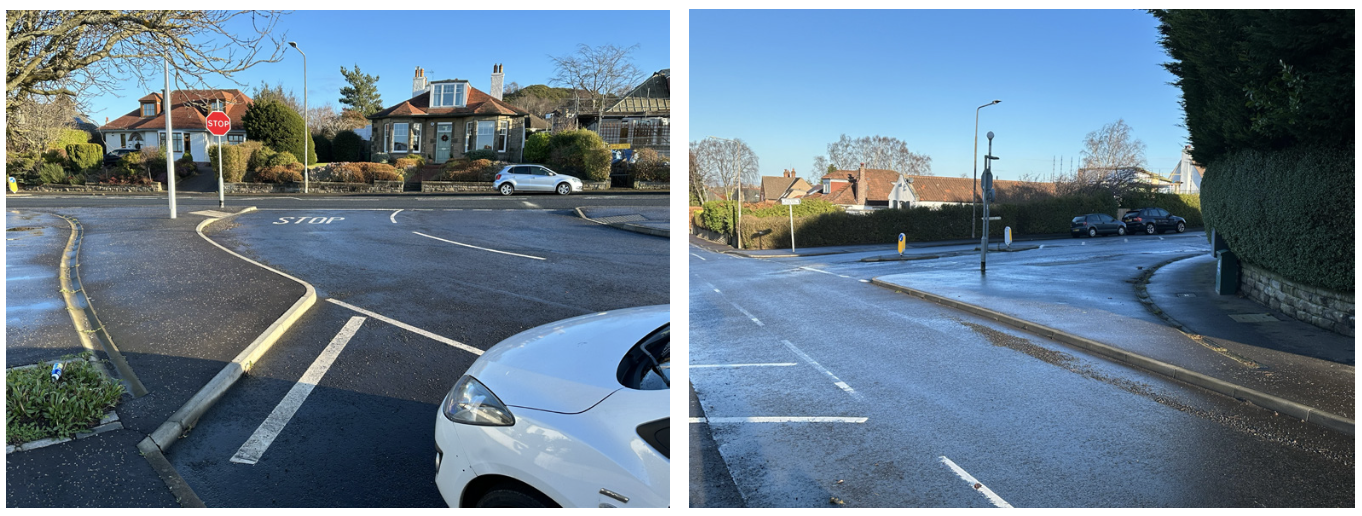
Two examples, again from Edinburgh, showing how corner radii, and therefore crossing distances and vehicle turning speeds, can be reduced in permanent ways that are easier on the eye.
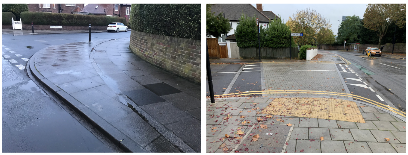
Above left: This junction, in Newcastle, shows how original design flaws can be permanently rectified. The radii are still a bit generous, in my view, but this is a simple example of the right idea (new dropped kerbs and tactile paving also provided). Above right: A raised side street entry treatment. These can be done well, like this one, but can also be done badly.
Accompanying these words are a number of photographs I’ve taken here and there over the years. Most are illustrations of the Bellmouth Factor, but some are examples of where Stevie Wonder’s 1966 advice has been taken to heart by the relevant authorities. And all credit to them, because the ubiquity of unjustifiable Bellmouths could make the scale of the challenge too daunting to take on. However, the adage “You’ve got to start somewhere” is just as true in the context of starting to effect change at side streets junctions as it is in any other context.
Some people, understandably, might think physically changing junction layouts has been rendered largely unnecessary by recent (2022) changes to the Highway Code that give greater priority to people walking (and wheeling and cycling) across side streets (https://www.gov.uk/guidance/the-highway-code). In doing so, they would cite the new Rule H2, which is for drivers, motorcyclists, horse drawn vehicles, horse riders and cyclists and says, “At a junction you should give way to pedestrians crossing or waiting to cross a road into which or from which you are turning”. (The equivalent rule requiring drivers to yield to people cycling at junctions is H3.) They might well also cite Rule 170, which was also in the previous version of the Highway Code. This rule, for drivers, is about taking extra care at junctions, and part of it states that, “You should give way to pedestrians crossing or waiting to cross a road into which or from which you are turning. If they have started to cross they have priority, so give way”.
The problem with these rules, as I see it, is twofold. Firstly, H2 and 170 are somewhat at odds with one another. The former says drivers should give way to pedestrians “crossing or waiting to cross”, while 170 implies pedestrians only have priority “if they have started to cross”.
Secondly, the vast majority of drivers have no idea that the new Rule H2 even exists, and never bothered observing the old Rule 170 anyway. As one of many examples that I and countless others could give, I had an encounter with a driver at a side street junction in Glasgow just last month, when he petulantly tooted at me and a colleague when he was turning in to a side street that we had begun to cross well before he began his manoeuvre. Not being someone who takes kindly to being tooted at by idiots, I stood my ground and encouraged him to “Read the Highway Code”. His response was a rather uncouth couplet with which I dare say we’re all quite familiar. I repeated my polite enjoinder to educate himself a couple more times and he, with what he may have considered to be rapier-like wit, repeatedly swore.
The general point that this sad tale illustrates is the most drivers, and indeed most people walking, work on the basis that drivers have priority at side street junctions; if only because most drivers assume it. Some people, when walking, may not like the idea of being subjugated in this way, but have nevertheless concluded that their safety is best served by giving in to the unwarranted bullying.
Here I find myself occupying a similar position to that taken by my fellow columnist, Tom Cohen, in his contribution to a recent issue, when considering the ‘Get out of my way’ messaging now prevalent by audio and visual technologies employed by commercial vehicles to ‘warn’ other walkers and wheelers in urban areas that they are in danger (see LTT884 and TAPAS, 23 January 2024).
For the avoidance of doubt, I’m not saying that I’m not glad the relevant Highway Code rules exist; but I am saying that – even if they were made perfectly consistent with one another, and even were they to be more widely publicised – the geometric layout of so many side street junctions sends a clear message that, in practice, motor vehicles come first; whatever the ‘rule book’ might say concerning the theory.
I mentioned earlier about new and comparatively new techniques that are under consideration to make it easier for people to cross side streets, specifically ‘simple zebras’ and ‘continuous footways’. The former constitute the familiar black and white stripes, but dispense with the zig-zag markings and Belisha Beacons. A trial of such crossings was introduced in Cardiff 2022, and this was reported on at the webinar I mentioned. I have included a couple of photos of one of the three trial sites. The purported advantages of simple zebras, which are not currently legal in the UK, is that, because they’re cheap, they could be rolled out very quickly, if approved. This could be a good thing, because almost all drivers acknowledge that zebras mean people walking have priority.
‘Continuous footways’ are the subject of new research undertaken by Living Streets (see LTT885 and https://www.livingstreets.org.uk/policy-reports-and-research/inclusive-design/), one of the principal findings of which was that many of new(ish) side street junction layouts called ‘continuous footways’ aren’t really continuous. I don’t have the time or space to go further into this research here, but I do want to highlight that one of things I especially liked about the Living Streets report was the coining of the term ‘Real Continuous Footways’. If you’re not quite sure what ‘continuous footways’ are, I include a couple of photos of ‘real examples’ to help illustrate (see below).
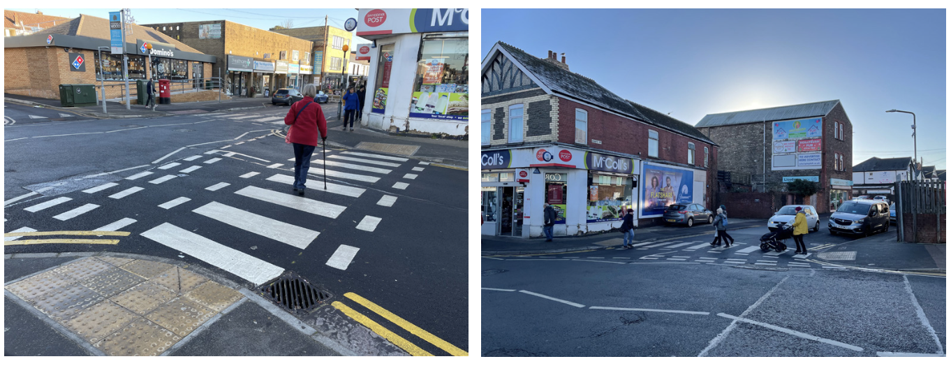
One of the trial ‘simple zebras’ in Cardiff, viewed from two angles.
(The zig-zags you can see are for the adjacent main carriageway regulation zebra.)
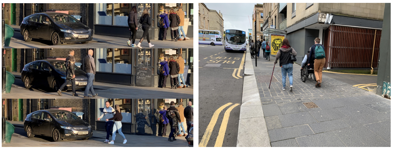
Above left: A triptych showing how a well-designed ‘real continuous footway’ can work well in the right context (this one’s in Clapham). The driver gets the message, and waits while several groups of people walk past, assuming their rightful priority. Above right: Another ‘real continuous footway crossing’ in an appropriate context, this time in Glasgow.
I have also included (page 4) a photo of a more conventional ‘raised side street crossing’ which makes no attempt to look like the footway continues over the junction moth, but simply makes it far easier for people walking or wheeling to cross by removing the need to negotiate kerbs or to go down and up ‘dropped’ kerbs.
I like a good raised crossing, I do. I also like a good ‘real’ continuous footway, in the right context (both of the examples I’ve shown are in such contexts). And I also like the idea of ‘simple zebras’. However, let me repeat what I said earlier: none of these techniques for improving the crossing experience at side streets can, in themselves, properly address the challenges that Bellmouth junctions present. It is therefore on dealing with the Bellmouth Factor that our attention should be most clearly focused if we’re to change the game for people walking and wheeling (and cycling).
It’s not controversial (other than possibly with some engineers who still assume that lots of people on foot should bow the knee to the occasional large vehicle). It doesn’t depend on unproven innovations. And it doesn’t require any special legal provision or any expensive materials. It just needs to be decided upon as sensible and desirable, and then to get done. En masse, and as soon as possible.
And so, in bringing this piece to a close, and for the second article in a row, I offer you a blueprint. This time, for making side street junctions way better for those users at the top of our sustainable transport hierarchy, as those junctions can and ought to be. Here goes:
-
Tighten up (reduce) corner radii. This reduces crossing distances and reduces vehicle turning speeds.
-
Raise the crossing. This provides level access; no going up/down; ensures no ponding issues on the crossing line; and avoids the residual small upstand so common at the bottom of dropped kerbs.
-
Install blister tactile paving on both sides of the crossing. This gives a clear, well-known tactile signal to vision impaired people.
-
Set side street speed limits to 20mph and main carriageway limits to 20-30mph*. This reduces vehicle speeds and makes shunts less likely. * Where the main carriageway speed limit cannot reasonably be reduced to at most 30mph, the extent to which the corner radii can be reduced may be limited.
-
Add side street kerb build-outs, where feasible. This narrows the crossing distance further and creates more room for people, which may be of particular value for wheelchair users. Likely requires particularly low traffic levels on the side street.
-
Manage the local highway network to reflect the objectives. i.e. minimise the number of vehicles needing to come into and out of the area that the side street(s) serve.
-
Consider ‘simple zebra’ or ‘continuous footway’ treatment where/when conditions/regulations/funding permit. This will signal to walkers and wheelers that the balance of road user advantage really has changed.
No.1 in this list is the key; even though Stevie Wonder’s seminal highway engineering single peaked at no.3 in the USA (no.14 in the UK). Maybe it’s time for a re-release of the song? Along with some relevant new DfT Design Guidance.
Speaking of which, you may have noticed from the main news item on the front of this issue that Active Travel England has just published four very useful design and review user manuals reflecting its work to specify and disseminate best practice. Of direct relevance to this piece is the Crossing Selector Tool User Manual which I commend to you.
These new documents are also, as it happens, most appropriate with respect to the forthcoming Building Better Crossings & Junctions conference, to be held in London on 13th March. Also organised by the LTT Editor’s colleagues, this event should surely be of considerable interest to anyone who’s managed to read my thoughts this far. Perhaps I’ll see you there?
References
•https://www.gov.uk/guidance/the-highway-code
•https://www.livingstreets.org.uk/policy-reports-and-research/inclusive-design/
•John Dales Street Talk: Up-tight, Everything’s Alright LTT699 June 2016
•Webinar recording 12th January 2024 Building Better: Side Street Crossings https://youtu.be/wTI-dH-plFI
•‘Get out of my way’ thinking is an unfair route to road safety, Tom Cohen, 23 January 2024
https://www.tapas.network/48/cohen.php
John Dales is a streets design adviser to local authorities around the UK, a member of several design review panels, and one of the London Mayor’s Design Advocates. He’s a past chair of the Transport Planning Society, a former trustee of Living Streets, and a committee member of the Parliamentary Advisory Council for Transport Safety. He is director of transport planning and street design consultancy Urban Movement.
This article was first published in LTTmagazine, LTT886, 20 February 2024.
You are currently viewing this page as TAPAS Taster user.
To read and make comments on this article you need to register for free as TAPAS Select user and log in.

Log in