TAPAS.network | 4 February 2026 | Commentary | Graham James
The new DfT connectivity metrics: What insights do the first outputs give us?

The new DfT Connectivity Tool is intended to become a core resource for more sustainable transport planning, especially for new developments. In the final part of our three expert contributions about the Tool, examines the results from the initial application of the metrics. What insights do they give us, and how may they help in thinking about transport policy especially in combination with other datasets? Can individual modal results help with service planning and improvement to support greater accessibility, and is the claim made in the DfT guidance that “driving by private car is the great equaliser” appropriate?
IN TWO PREVIOUS ARTICLES, David Metz and I have described the UK Department for Transport’s (DfT’s) new connectivity metrics and the accompanying tools, how they work, how we can best use them, and what the benefits to transport planning might be (LTT 9291, 9302).
To complete the series, I will focus here on the output results from this first, experimental version of the metrics. What insights do they give us, and how can they help us think more effectively about transport policy?
First, some housekeeping. My comments are based on the metrics as they stand, and are subject to the methodological caveats (about their limitations and some of the technical factors in how they are compiled from the underlying data) that I raised in the first article.
The metrics cover England and Wales. The connectivity tool has scores for a national grid of 100m squares. The published dataset has scores for census output areas (OAs) and lower super output areas (LSOAs). These different versions of the scores sometimes reveal distinctive nuances. I’ve drawn from both the tool and the dataset to illustrate this article3. The placement of category boundaries in colour ramps can also hide or reveal detail, so it’s always worth looking at the data in more than one way if you can.
Starting at the top
Let’s start at the top level, with the headline measure: the ‘overall (except driving)’ connectivity scores (Figure 1).
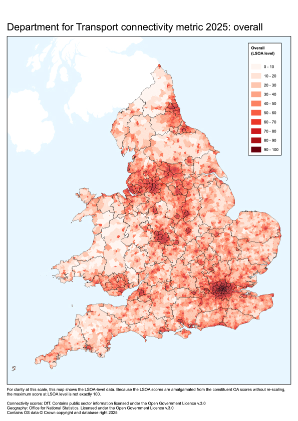
Figure 1: the overall (except driving) scores: they approximate to an urbanisation map
The comment has been made that these scores fundamentally mirror the levels of urbanisation and urban density. This is not wholly so, however, as there are nuances if you look closely. The 100m grid used in the connectivity tool also reflects the patterns of rural main roads (Figure 2), and suburban main roads in the conurbations. In London the OA-based dataset (but less so the 100m grid) reflect some strong multimodal ‘high road’ corridors (Figure 3).
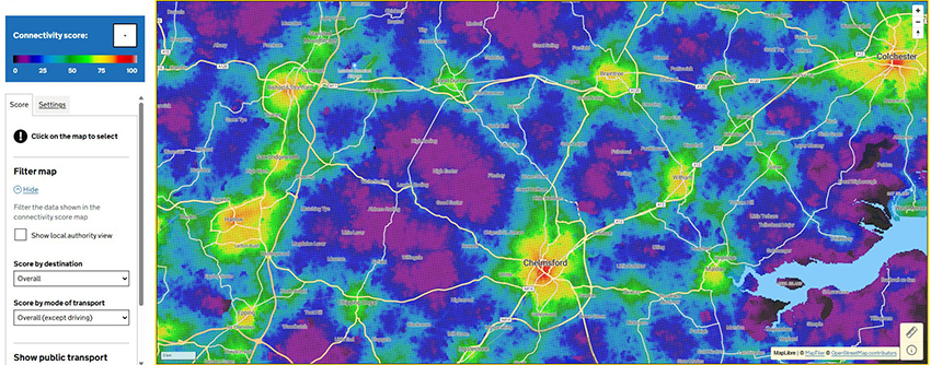
Figure 2: At the 100m grid level, the pattern of scores also reflects the pattern of main roads.
The lite tool includes a roads layer overlay, seen here as a web of yellow lines. Rural main roads, such as those between Bishops Stortford or Great Dunmow and Chelmsford, can be seen to influence the scores through the non-driving access they offer (subject to caveats about their attractiveness as active travel routes).
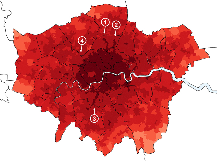
Figure 3: At the OA or LSOA level, some of London’s strong multimodal ‘high road’ corridors come through
LSOAs in Greater London. Same colour ramp as Figure 1. Locations outside Greater London are omitted for clarity. The ‘fingers’ coming through are (1) the Green Lanes / Piccadilly line corridor, (2) the Tottenham High Road corridor (partly with the Victoria line), and (3) the Tooting High Street / Balham High Road / Northern line corridor. The Edgware Road corridor (4), which does not have a closely corresponding Underground line, does not appear as strongly.
Nevertheless, the urbanisation point is essentially true. This in turn has led to comments that the metrics tell us what we already know: people are most connected in towns and cities, where there is a high density of people, jobs, services and transport. Hence the question: what’s the point of the metrics? Surely we knew all this?
There are three answers:
-
The fundamentals always bear repeating.
-
Decision-makers need evidence, not just transport planners’ received wisdom.
-
And the more we dig, the more interesting questions turn up.
So let’s repeat the fundamentals. Urban density drives connectivity in a virtuous circle. And in reality, rural areas will always have lesser connectivity.
The most obvious divide is not north-south, or even the south-east versus the rest. The spectrum of connectivity has cities at one end and deep rural areas at the other. As so often the case in our patchwork national landscape, there are areas of low connectivity in all regions. Taking the south-east corner as an example, pockets of rural Kent, Sussex and Surrey have connectivity (on this metric) below 20% of the national best (Figure 4) – putting them on a par with areas of rural Westmorland or North Yorkshire.
At the other end of the spectrum, it is perhaps reassuring that our city centres and large town centres are still the best-connected places. As a profession we sometimes wonder – or worry – about whether edge-of-town, primarily car-based, retail parks are becoming the ‘new town centres’. But the data show these are not as well-connected as the traditional town centres. Even on the ‘shopping (driving)’ metric, the traditional centres manage to keep pace.
As I mentioned in LTT 928, the metrics really illustrate the high connectivity of urban cores. Concentration of development in these locations, and with urban densification, is a good way of supporting sustainable travel patterns. But if that’s not enough, or is simply not the policy direction, the metrics confirm the importance of making new towns and urban extensions into genuinely hub places, not just dormitory towns or suburbs.
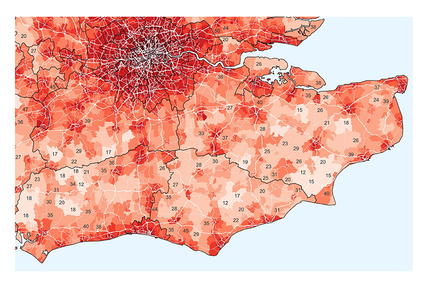
Figure 4: All regions have areas with relatively low overall connectivity, as seen here in the south-east
LSOA level. Same colour ramp as Figure 1. Labels are shown for selected LSOAs.
Drilling-down
Drilling down to individual modes or purposes, the relationship with urbanisation continues to dominate – but more nuances emerge. Figure 5 shows the modal scores. Remember that as each metric scales its scores from 1 to 100 at OA level, we can only compare across different metrics in terms of relative positions on each scale.
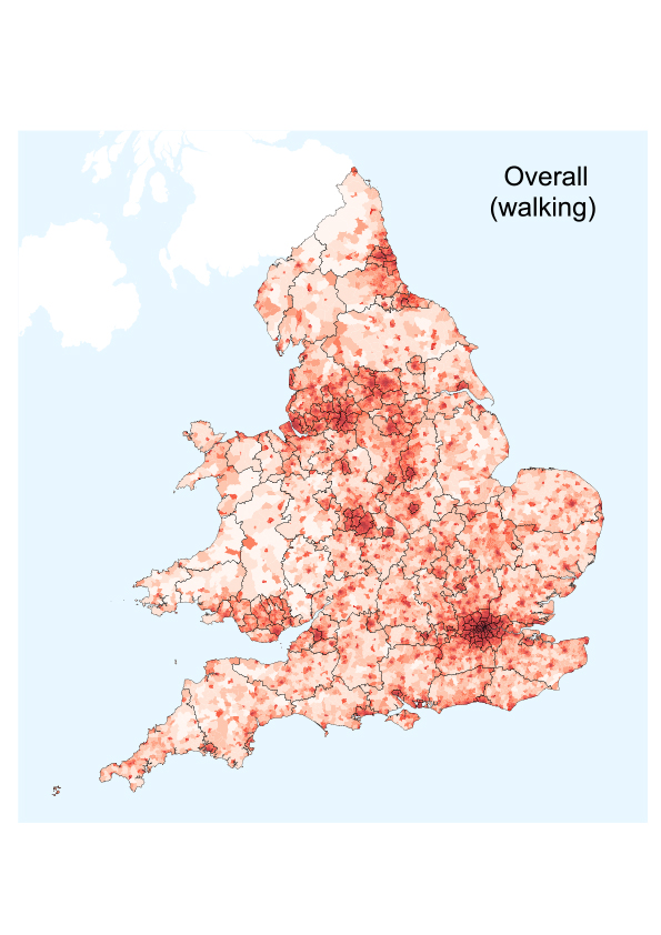
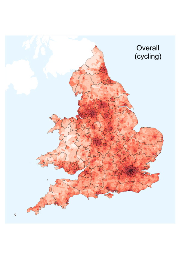
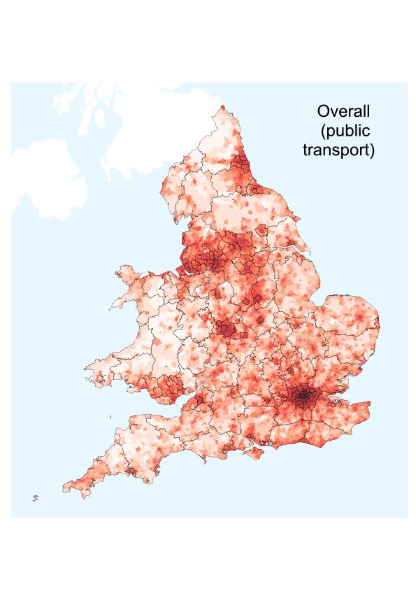
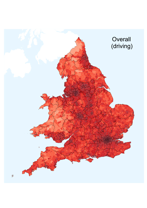
Figure 5: scores for each mode also show the impact of urban density – but nuances begin to emerge
LSOA level. Same colour ramp as Figure 1.
Unsurprisingly, the walking scores show a very crisp distinction between rural and urban connectivity. The pattern is much more diffuse for cycling scores, with cycling offering access to urban centres from their cycling-distance hinterlands (at least in theory: if people are actually willing to get on a bike).
The map of public transport scores is generally similar to the ‘overall’ map, essentially reflecting the strong relationship between public transport levels and urbanisation. However, the network structures are now a little more visible, with some strong bus corridors coming through in the big cities when you zoom in (Figure 6, Figure 7). Counter-intuitively, light rail systems don’t seem to show up as strongly, perhaps influenced by the walk times to stops that are generally more widely spaced than bus stops (Figure 7, Figure 8). And for rural towns, being on or off the rail network sometimes seems to make little difference on this measure (Figure 9). Are these results just quirks of the metrics, or do they have implications for transport planning and policy?
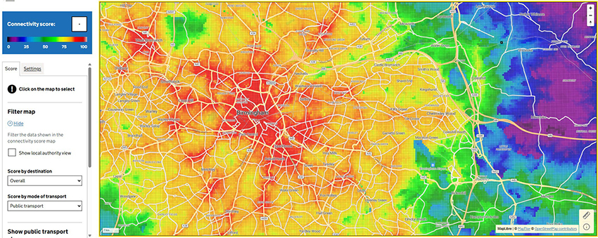
Figure 6: In major cities, strong bus corridors can also come through in the data
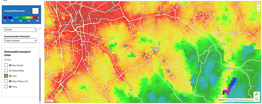
Figure 7: Light rail lines tend to come through less strongly than bus corridors
This is suburban London. Croydon, a major employment, retail and transport hub in its own right, is in the top left. The main bus corridors come through as red fingers. For example, the corridor extending south-east from Croydon to Selsdon has around 12 buses per hour each way. However, the tram corridor to Addington and New Addington, with around 8 trams per hour, features much less strongly. It is possible that the wider spacing of tram stops – and consequential walk times – is bringing down the scores. If you look carefully, the tram stops do come through as mini-hotspots.
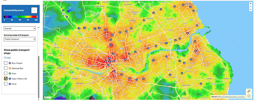
Figure 8: Tyneside – the metro stops are (slight) hotspots
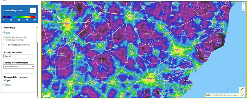
Figure 9: for rural towns, being on or off the rail network sometimes makes little difference to the public transport connectivity score
Haverhill and Saffron Walden (in the centre left of the map) are not on the rail network - but their connectivity levels appear broadly similar to those of equivalent-sized towns which are, such as Sudbury and Newmarket respectively. Note that at this zoom level, a coarser grid is shown, not the detailed 100 metre grid.
The map of driving connectivity is the most different from the others. It has a more even pattern of scores, with relatively few locations in the lowest brackets. At the 100m grid level, the pattern of main roads also comes through when you look closely: being within a few hundred metres of a main road naturally boosts a location’s driving connectivity score.
Nevertheless it’s still primarily about urbanisation, with the highest scores concentrated in the cities. Different considerations, of course, apply to freight and distribution, which these metrics don’t focus on.
Discussions on social media have picked up the very high levels of driving connectivity, according to the metric, in central and inner London. Most of this area has a score of 90 or more for ‘driving (overall)’, with the centre having the highest scores of all (Figure 10).
In fact, it is not just a London issue: there are similar 90+ scores throughout the central and inner areas of our other major cities.
These results are counter-intuitive. Surely these are the most congested areas, with the most restrictions on traffic due to roadspace reallocation and other transport policies? Surely driving connectivity would be low?
As I said in the first article of this series, and DfT acknowledges, the metrics don’t include the financial cost of travel. Usually this will roughly scale with the travel time and can be ‘taken as read’, but in some situations it could be a significant limitation. For city centres, the driving metric doesn’t currently reflect the cost of parking (or the time penalty of parking some distance away from your destination), the London congestion charge or other daily fees. I would certainly like to see the result of bringing these into the calculations.
But we must also remember that cities – and particularly London as a primate city – are concentrations of people, jobs and services. I suspect that the sheer weight (density) of reachable destinations is a major and genuine factor in these high scores in London and elsewhere.
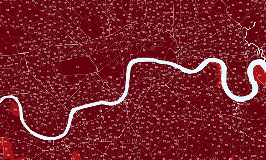
Figure 10: Driving connectivity scores are very high in central London and other cities – do we believe it?
Other metrics
I don’t have space to cover all the remaining metrics, but I would encourage you to explore them and how they compare to each other. Here is one example: Figure 11 shows access to healthcare, overall and by driving. The urban-rural split shows up particularly strongly on the former.
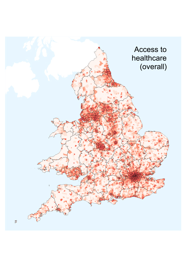
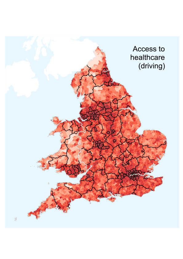
Figure 11: For access to healthcare, the urban-rural difference is particularly strong
Digging deeper
So far, we have just looked at the individual metrics. But there could be further insights if we go beyond this. Cross-tabulations allow us to look at the relationships between the metrics, and to consider how places can be characterised by their performance on combinations of the metrics.
To get things going, Figure 12 plots the overall driving and overall public transport scores against each other. We have already seen that all the metrics tend to reflect urban density and agglomeration, so the overall correlation between these two metrics is not a surprise. But note how there are no LSOAs whose driving connectivity is below 30% of the best – whereas the public transport connectivity has a much longer ‘tail’ of poor-scoring areas, heading down almost to zero. Put another way, the driving connectivity is more evenly-spread than the public transport connectivity. This, of course, also came through in Figure 5.
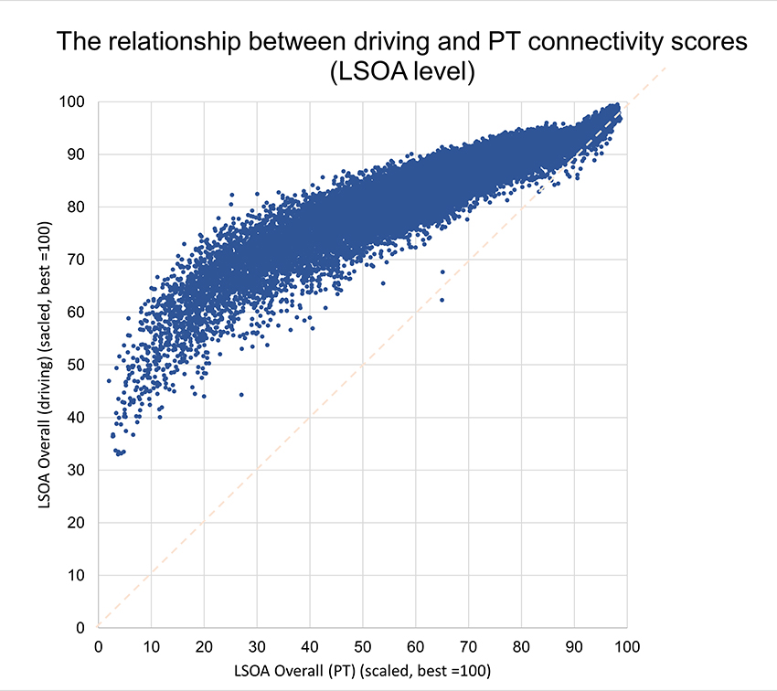
Figure 12: Driving and PT accessibility scores are correlated, but PT has a longer ‘tail’ of low scores
What would you expect the pattern to be if you cross-tab driving and walking scores? Figure 13 shows this. Compared to Figure 12, the pattern is subtly different. There is more of an oval distribution in the mid-range of the walking scores, including a set of locations (circled in red) with a lower driving score than might be expected from the walking score (or, put another way, a higher walking score than might be expected from the driving score). I’ll leave readers to think about – and data scientists to number-crunch – what sort of places or neighbourhoods this part of the distribution highlights. Here’s a clue: When I took a look, the answer wasn’t what I had expected – but it made sense.
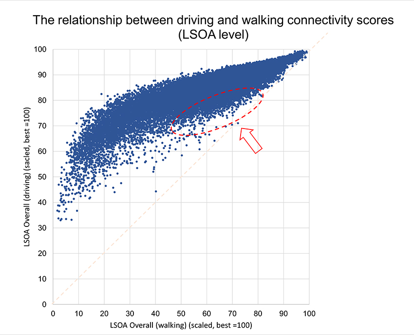
Figure 13: The cross-tab of driving and walking accessibility scores shows more variation, compared to driving v PT
These are relatively simple cross-tabs. I would like to see what the data clustering experts make of this dataset, perhaps being able to find different archetypes of places and areas. Such an exercise may or may not tell us much beyond what we instinctively know – but even if not, it’s always good to have our existing understanding confirmed. As I say, it’s always worth reminding ourselves of the fundamentals.
Equality?
The metrics themselves are broadly policy-neutral, give or take any potential value-judgments inherent in the technical choices such as weighting across modes. But the conclusions to be drawn can be laden with values.
The DfT guidance document4 on the metrics includes some commentary on the results. Pointing to the driving connectivity map, it suggests that “driving by private car is the great equaliser for England and Wales”.
This truism deserves scrutiny. It is indeed true, in the limited sense that in the deeper rural areas, where many day-to-day destinations are beyond walking or cycling distance – and there is little or no public transport – the car does bring the level of connectivity up from being a handful of percent of ‘the best’ to perhaps 30-60% of the best (Figure 12 and Figure 13). But that’s still not very equal5.
Furthermore, the car is only that kind of equaliser if you have access to one: which means if you can drive and can afford to run one, or have a degree of access through friends and family. Many people don’t. Rural areas are the ones with the greatest inequality between car users and non-car users. If equality is the goal, and if the car is really the great equaliser, is the policy solution therefore a subsidy programme that ensures everyone can have a car of some sort, with the prospect of a great leap to autonomous vehicles for those who cannot drive their own? Surely that would equalise access even more?
Or is that the wrong approach altogether?
Perhaps ironically, the central urban areas have, as described earlier, very high driving connectivity, helped by the sheer concentration of destinations, and inner urban areas are not much less so. This is missing something, and I’d like to see the impact of considering financial costs (as previously mentioned) in the next iteration of the metric. But as it stands, connectivity by car (even if we can’t quite call it ‘motoring freedom’) is strongest in the urban cores. The metric offers little evidence, for example, that the progressive creation of filtered permeability6 in many areas over recent decades has materially constrained people’s ability to get around.
According to this metric, there is still a lot of scope for shifting the balance of what we prioritise in urban transport. Reallocating roadspace or green time in those central and inner areas, in a way that reduced driving connectivity by, say, 10%, would still leave them high on the list for driving connectivity, even without considering the high levels of connectivity still available by other modes. This could be done by any suitable combination of price (not yet covered in the metric), speed or physical access. It would also make more space, safety or money available for all the other things – in transport or otherwise – that we want to see in cities. And it would further equalise that driving connectivity map.
If all this is politically unpalatable, we’re back to the old-fashioned idea of improving rural public transport (a topic in itself), or else turning our attention to how and where public services are provided and what level of connectivity people in different types of area should be able to expect. As always, the data are just the data. The policies and trade-offs are for us, or our decision-makers, to choose.
Homing-in on the transport planning dimension
A running theme in this article has been that half the battle with achieving transport connectivity is actually achieving urbanicity, concentration of activities and development density.
The next step is then to see if there are places that are less well connected than they should be, given their level of urbanicity. In other words, places where the transport system is not as good as it should be for that kind of town or city. Are there areas that have lower connectivity than their peers – and hence are where transport investment could be focused and well-justified?
This kind of exercise might, for example, provide hard evidence for or against the received wisdom that, thanks to historic underinvestment in transport, connectivity for cities in the north of England is worse than for London, and perhaps other cities in the south or south-east.
How can this be measured? One way would be to assume a perfect (or at least uniform) transport system, to get a connectivity score that reflects the urbanicity alone. The ratio of this score to the conventional connectivity measure will show how much the transport system capitalises (or not) on the destinations that are available. The National Infrastructure Commission (NIC) used this type of approach in their 2019 connectivity metrics (Figure 14.)7
Applying a similar approach to the DfT’s much more granular metrics might require creation of a theoretical uniform network for each mode – or perhaps that result might be achievable mathematically without the need to construct dummy networks. I’ll let the data experts and mathematicians ponder this one.
Figure 14: The NIC’s connectivity metrics, which looked at urban areas, assessed the effectiveness of the transport network in connecting urban areas within themselves and to others.
Source: National Infrastructure Commission, Transport Connectivity Discussion Paper, February 2019, Figure 4. The NIC’s calculations were for the 1,000 most populated built-up areas in Britain. They published two sets of measures, covering urban connectivity (within the place, based on travel times to its centre) and inter-urban connectivity (between places). There was a range of versions of each measure, covering car and public transport access, both peak and off-peak. For urban connectivity, shown on the maps reproduced here, the real-world travel times from each point in the place to its centre were divided by theoretical ‘straight line 50km/h’ travel times, and weighted by distance from the centre. This produced a normalised measure representing the transport network’s effectiveness, weighted by proximity (as a proxy for the likelihood of making the journey). The inter-urban measure was similar but on a centre-to-centre basis.
Mash-ups and wider policy issues
Alongside the issues I’ve raised about the outputs of the Connectivity tool in this article, I would also encourage readers to try mashing these metrics with other datasets, to see what patterns can be picked out.
For example, you could try comparing them with the latest indexes of multiple deprivation in England or Wales. Transport investment is often promoted on the basis that transport connectivity drives economic growth and wealth. But this is nuanced: high connectivity isn’t always associated with low deprivation, and there are other factors (such as skills) in play. We can look at the data and see what the correlations are – and think for ourselves about causation and consequence.
Another area to explore is that of coastal towns and the multifaceted challenges that many of them face. As well as issues of industrial and employment structure, geographic isolation is seen as one of the challenges: it is sometimes pointed out that, for a start, they only have half of the hinterland and therefore connectivity that inland towns of a similar size have. How true is this in reality? Can the metrics demonstrate or disprove this?
Conclusions
I hope my (relatively shallow) dive into the data now available from the connectivity metrics has whet your appetite to do likewise. They offer a lot to explore, whether through the DfT’s own tools, your own analyses of the datasets, or combining them with other data.
While there is some truth in the view – perceived at first glance – that the metrics amount to urbanisation maps, and tell us what we already know, the fundamentals always bear restating, and it’s always good to have evidence in support of them. And in any case, the more you look, the more nuances you find.
Looking more closely at the scores will also raise questions, and might confirm or challenge what you instinctively think. If it confirms, that’s not a waste – it’s hard evidence that will help you get your message across. If it challenges, that’s also good – it means we will learn new things, or at least start to think about the implications.
In these articles I have also covered some ways the metrics could be extended to provide additional insights: by developing ‘car available’ and ‘car not available’ analyses, and by looking at how well a location’s transport system actually provides access to the potentially reachable opportunities.
The metrics won’t necessarily be the right tool for every purpose. For example, decisions about where public services are located will still benefit from conventional catchment-area or isochrone analysis. There is still a role for the customisable connectivity analyses that existing commercial software can produce. And as I’ve mentioned before, selecting and assessing development sites will involve more than simply picking locations that the computer highlights with high scores.
But the metrics and accompanying tools are a valuable and easily-available addition to the resources and techniques available for assessing and demonstrating locations’ connectivity, feeding into investment and policy decisions. Hopefully the DfT will progressively address the limitations of this first, experimental round of the metrics. And I hope they and users in the transport planning, development and public policy communities will explore what further analyses and capabilities could be built on these foundations.
Acknowledgements
Map data sources: Department for Transport, Office for National Statistics, Ordnance Survey. Contains public sector information licensed under the Open Government Licence v3.0. Contains OS data © Crown copyright and database right 2026
Thanks to Tim Gent for helpful discussions and ideas during the development of this commentary. All opinions expressed are nevertheless the author’s own.
References and Links
-
LTT magazine, The new DfT connectivity metrics: What do they do, and how can we use them? James G. LTT929 8th January 2026
-
LTT magazine, Transport Connectivity – yes, a valid idea, but one with limitations in the real world of decision-making Metz D. LTT930 22nd January 2026
-
For maps based on the dataset, I am showing the amalgamated LSOA-level data in order to make the maps readable on the printed page while retaining meaningful granularity. The colour ramp differs from that used in the lite tool.
-
DfT, Guidance: Transport connectivity metric, 29 September 2025, https://www.gov.uk/government/publications/transport-connectivity-metric/transport-connectivity-metric
-
Whether it is acceptable (‘good enough’) in absolute terms is a separate question.
-
This involves managing the street network so that people walking and cycling can take the most direct routes around neighbourhoods, and car trips are still accommodated, but through-trips by motor traffic on inappropriate routes are discouraged. ‘Low-traffic neighbourhoods’ is a contemporary term for this, but it is not a new phenomenon.
-
https://webarchive.nationalarchives.gov.uk/ukgwa/20190301131207/https://www.nic.org.uk/how-well-connected-are-our-cities/. The discussion report is linked from this page. The full technical report is at https://webarchive.nationalarchives.gov.uk/ukgwa/20190301132358/https://www.nic.org.uk/supporting-documents/prospective-july-2018-transport-connectivity-report/ and the dataset is at https://webarchive.nationalarchives.gov.uk/ukgwa/20190301131938mp_/https://www.nic.org.uk/wp-content/uploads/Transport-connectivity-data.xlsx
Graham James is a Technical Director at the transport planning consultants Galle Saliman and Parking Perspectives. He studied geography and began his career on the policy and research staff of the London Regional Passengers Committee (now London TravelWatch), before moving into the consultancy sector. He is a Treasury-accredited Better Business Cases practitioner and he lectures in Transport Economics.
This article was first published in LTT magazine, LTT931, 4 February 2026.
You are currently viewing this page as TAPAS Taster user.
To read and make comments on this article you need to register for free as TAPAS Select user and log in.
Log in