TAPAS.network | 18 December 2024 | Commentary | John Siraut
Counting the changing cost of travel- not quite what it sometimes seems

How significant is the cost of transport to household budgets – and has it being going up? What are the relative movements in car, bus and rail travel expenditures - and why? Is government policy a major influence? unpicks the data and finds some important fundamental factors, emerging trends and regional variations
CONSUMERS, media commentators, politicians and transport professionals all have strong- but often significantly differing views on what the proper cost of travel should be. There are also lots of (frequently mistaken ) beliefs about how fares and charges have moved over time, and what lies behind those changes.
It doesn’t take long scrolling through social media to find posts complaining about the price of fuel, airfares during school holidays, bus and rail fares generally. More specifically, the mainstream media makes great play of the annual rail fare increase which tends to get announced three times. Once when the July retail price index is published (which is used to determine January’s increase), once sometime in the autumn when the government announces what the increase will be, and again in January when the fares actually go up. This tends to give the impression that transport costs are forever increasing.
So what are the true facts of the matter?
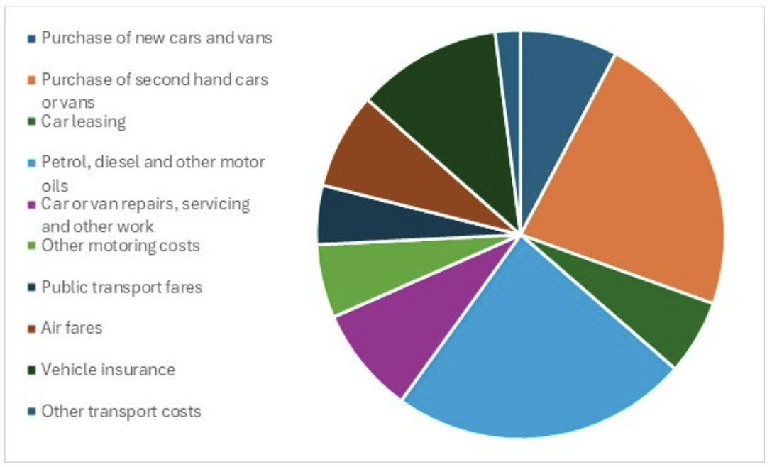
Let’s start with how much we spend on transport. According to the Family Spending Survey (August 2024) the average household spent £89.50 a week on transport in 2023. About 85% of that goes on the cost of owning and operating cars or vans. As seen in figure 1, the largest cost elements are the purchase of vehicles (mainly, for most people, second hand), fuel and insurance. Relatively little is spent on public transport fares, and in fact, the average household spends more in a year on air fares.
Figure 1: Breakdown of average household expenditure on transport
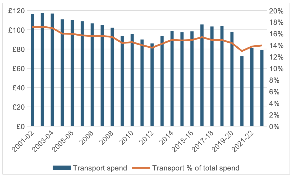
Despite general complaints about how expensive travel is, the amount spent on transport has in reality steadily declined over time. Both in absolute terms and as a percentage of total household expenditure, as shown in figure 2. Obviously, the pandemic led to a large fall in expenditure on transport, but even post-pandemic in 2022-23 it was around £40 a week less than 20 years ago, and as a proportion of total household expenditure it was down three percentage points over the same period, now sitting at about 14%, when it was then 17%.
Figure 2: Average weekly household expenditure on transport in constant prices and as a % of total household expenditure
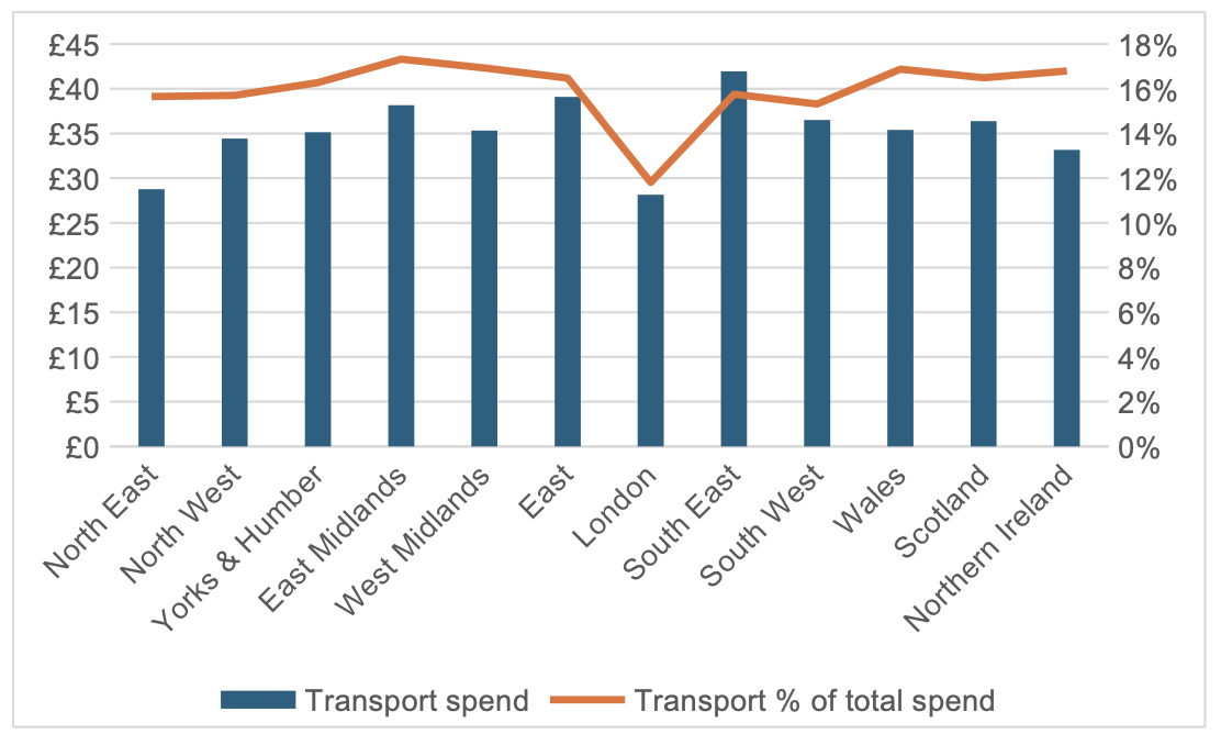
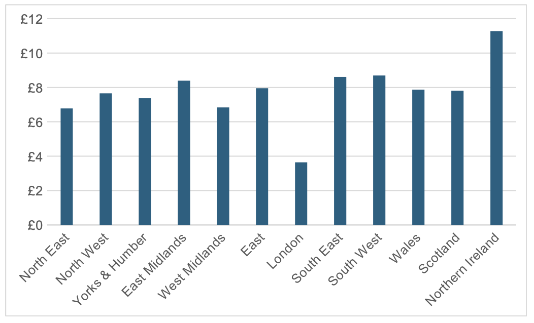
At a regional level, spend on transport varies considerably, as shown in figure 3. This shows spend on transport by person and as a percentage of total personal spend. (The data is a three-year average and therefore impacted by the pandemic, but this is unlikely to materially change the regional differentials.) In absolute terms, individuals in the South East ( excluding London) spend the most on transport, over £10 a week more than someone in the North East or London itself. However, as a percentage of weekly spend it is those in the East Midlands who spend the most, with transport accounting for 17.3% of their weekly expenditure compared to just 11.8% in London.
Figure 3: Average weekly expenditure on transport by person by region and as a % of total expenditure
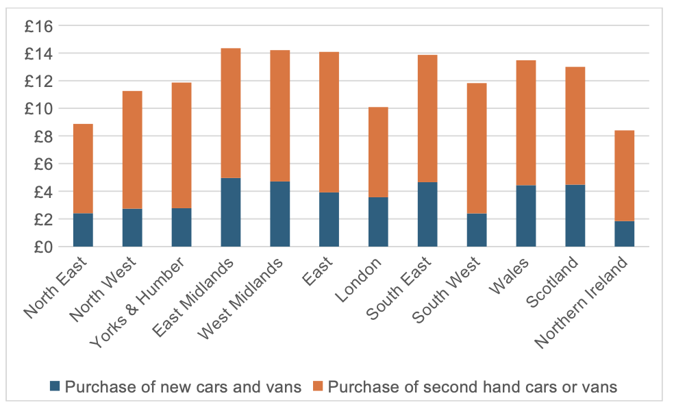
What explains these regional differences? The next set of figures breaks down transport expenditure by its main components. The biggest element is the purchase of vehicles. As figure 4 shows, there are significant differences across the regions in this part of transport expenditure. The average person in Northern Ireland spends the least in total, almost half the level of someone in the West Midlands. While those in the East Midlands spend the most on new cars and those in the South West spend the least.
Figure 4: Average weekly spend per person on new and used vehicles by region
The next biggest item of expenditure is on fuel, petrol and diesel. Figure 5 shows that average weekly spend per person is far higher in Northern Ireland than the rest of the UK and far lower in London. This is despite fuel prices in Northern Ireland tending to be the lowest in the UK and those in London the highest. Over time, it will become increasingly difficult to determine how much people spend on fuel as we move over to electric vehicles.
Figure 5: Average weekly spend per person on petrol and diesel by region
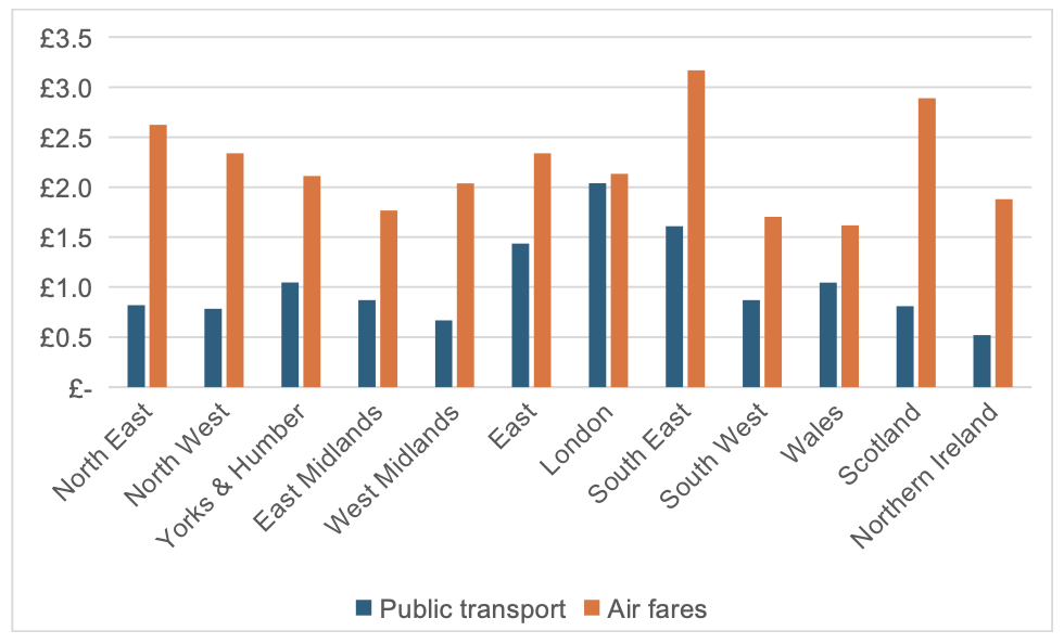
Beyond motoring costs, figure 6 examines average spend per week per person on public transport and air fares. As noted above, the impact of the pandemic will have reduced total spend on these items. However, in all regions annual expenditure on air fares is generally much higher than on public transport. As expected, London has the highest spend on public transport, four times higher than in Northern Ireland. Interestingly,spending on airfares, does not appear to correlate to income levels,with Scotland, North East and North West all having spend per head higher than London. Spend on overseas package holidays, which will usually include a flight also varies considerably between regions. Ranging from £3.70 per person per week in Northern Ireland to £7.50 in the South East.
We can speculate more generally on where transport and travel expenditure sit in people’s wider ‘lifestyle’ equation- and the dominance of the car in that .For example, London’s lower spend on transport is driven by far lower expenditure on fuel and to a lesser extent on vehicles than occurs in other regions.
Figure 6: Average weekly spend per person on public transport and air fares by region
Back to air travel, using detailed inflation data from the Office for National Statistics (ONS), it is possible to analyse how transport prices by mode have changed in recent years and Figure 7 illustrates the real-term changes in airfares since 2000. The most noticeable feature is the seasonality, with distinct peaks in December and the summer. Airlines have long used yield management, offering low fares during off-peak times to keep planes full. Ancillary revenues, such as those from extra services, have become increasingly important, making load factors as important as yields. For instance, a third of Ryanair’s revenue now comes from ancillary services.
A 12-month moving average is also shown to better illustrate the underlying trends. Air fares gradually decreased until 2007, falling about 10% in real terms compared to 2000. However, after the global financial crisis, fares steadily increased, up by around 30% by 2016 and then they remained relatively flat until the pandemic. As travel restrictions were subsequently lifted, the surge in demand led to rising fares, which have now stabilized but are approximately 60% higher than in 2000.
Figure 7: Index of air fares deflated by Consumer Price Index - 2000 = 100
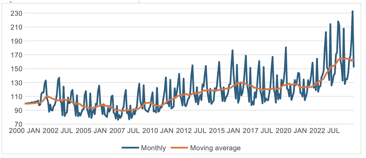
Source: https://www.ons.gov.uk/economy/inflationandpriceindices/datasets/consumerpriceinflation
Data for other modes of transport only goes back to 2015. giving a shorter time horizon. Rail inside and outside London is an interesting contrast Figure 8 shows the divergence between national rail and effectively London Underground fare levels. Rail fares increased faster than inflation between 2015 and 2021. They, then fell in real terms as increases did not keep pace with the large rise in inflation in 2022. London Underground fares were frozen between 2016 and 2021, so fell in real terms and again did not rise by the high levels of inflation, so in 2024 they are around 8% less in real terms than in 2015.
Figure 8: Index of rail and underground fares deflated by Consumer Price Index - Jan 2015 = 100
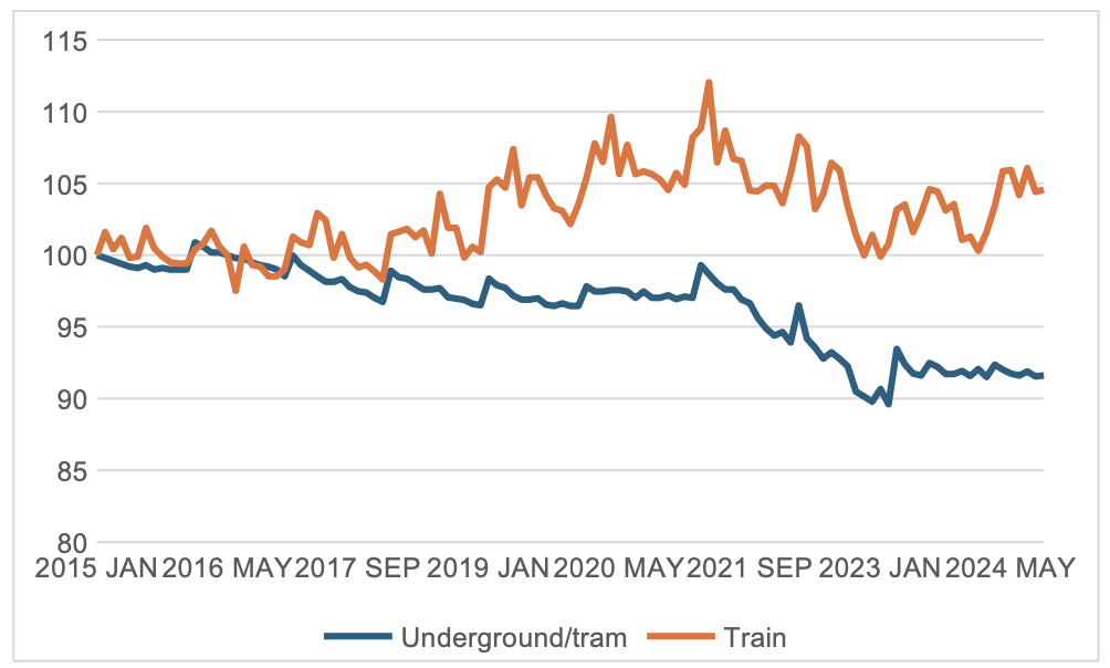
Source: https://www.ons.gov.uk/economy/inflationandpriceindices/datasets/consumerpriceinflation
However, the rail data looks different when examined by ticket type. Figure 9 shows the average fare paid per kilometre in constant prices for four ticket types and overall. The total average fare paid was broadly constant between 2015 and 2020 which does not match the ONS data. In part this is because the ONS data is tracking the cost of the same bundle of journeys and ticket type over time. The average fare paid, however, reflects market changes, including changes in origins and destinations (where average fares per kilometre differ), moves from first to standard class travel, and from unrestricted to restricted advance tickets. Following the pandemic there has been a marked fall in the average fare paid for most ticket types. This reflects a change in the type of journeys being made (e.g. reductions of first-class business travel) and an increase in the proportion of off-peak fares, as leisure traffic ( especially at weekends) has grown.
Public transport has long fought to square the challenging economics of having to provide considerable capacity during the morning and evening peaks which is underutilised for the rest of the day. Hence off-peak fares are generally around 40% lower than peak fares to achieve some time shift, and to generate additional discretionary travel. Regular travellers have come to expect a discount, if questionable practice in business terms, and it is notable that the average fare per kilometre for season tickets closely tracks that for off-peak tickets. Hence the discount for regular peak travellers for whom it costs most to provide the service is the same as the one offered to more discretionary travellers where the aim is to generate extra demand.! On some long-distance routes, you only need to make two peak return trips a week to make it worthwhile buying an annual season ticket.
Amongst the more general range of fares advance purchases are the cheapest, and the discount on the average off-peak fare has increased from around 10 to 20% over the period of 2010 to 2024.
Figure 9: Average price per kilometre by ticket time in constant prices
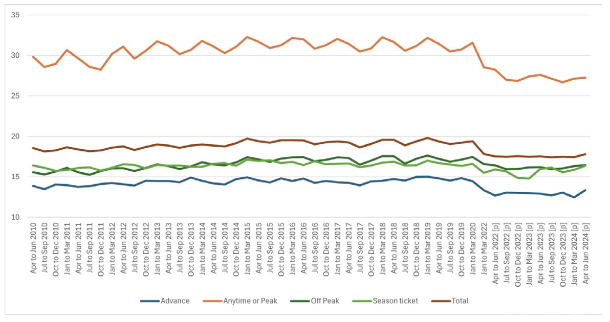
Source: https://dataportal.orr.gov.uk/statistics/usage/passenger-rail-usage/
The experience of bus passengers has been very different from rail users, with steady increases in fares (see figure 10), up by 20% in real terms between 2015 and 2017, then broadly stable until the pandemic, followed by some fairly wild fluctuations.
The result is that bus fares in 2024 are nearly 40% higher than a decade ago. The £2 fare cap does not seem to have had much impact on the index. Perhaps surprisingly, taxi/minicab fares have remained fairly static in real terms over the last decade. This is likely due to a switch from more expensive taxis to cheaper minicabs and the entry of providers like Uber into the market. Research shows that Uber drivers spend significantly more time and drive substantially more miles with a passenger in their car than taxi drivers, enabling lower fares to be offered. The cross-elasticity between bus and taxi/private hire options seems little studied, but quite significant.
Figure 10: Index of bus and taxi/minicab fares deflated by Consumer Price Index - Jan 2015 = 100
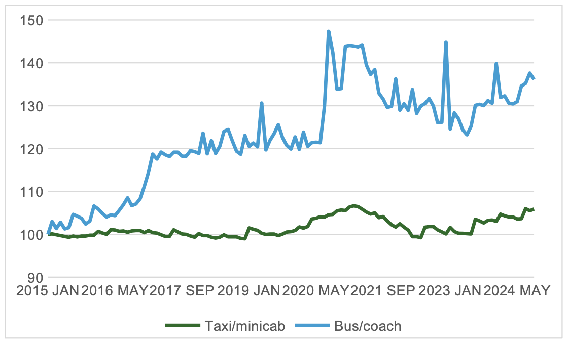
Source: https://www.ons.gov.uk/economy/inflationandpriceindices/datasets/consumerpriceinflation
Finally, what about the movement of day- to- day ‘marginal’ motoring costs, generally seen as the decision-making comparator to public transport fares ? Figure 11 shows motoring costs, including and excluding the purchase of new and second-hand vehicles. As highlighted previously, fuel is the principal non-vehicle purchase cost, and this follows a more erratic pattern than the total motoring cost index. Apart from the hike in fuel prices in the 2022 ‘energy crisis’, motoring costs have been relatively stable over the last ten years tracking the underlying inflation rate. So that, in 2024 total motoring costs are less than they were a decade ago. Given all public transport modes have seen real price rises this further increases the attractiveness of the car.
Figure 11: Index of motoring costs, with and without vehicle purchase deflated by Consumer Price Index - Jan 2015 = 100
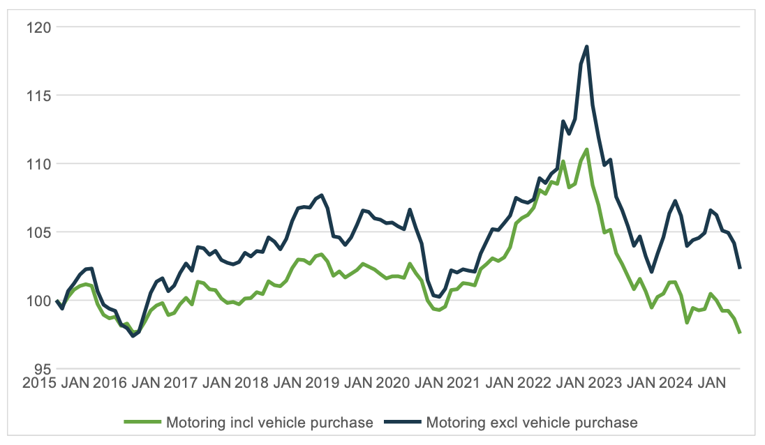
Source: https://www.ons.gov.uk/economy/inflationandpriceindices/datasets/consumerpriceinflation
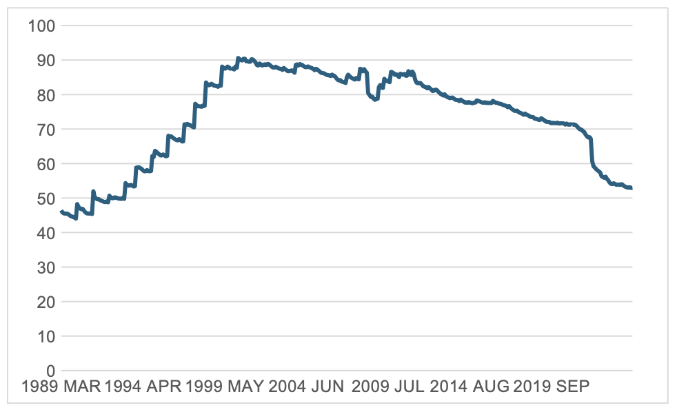
A key reason why motoring costs have fallen is shown in figure 11. After vehicle purchase costs, the price of fuel is the largest component of motoring costs. A significant proportion of the cost of fuel is tax, principally fuel duty. The graph shows, in today’s prices, how the level of fuel duty on a litre of unleaded petrol has changed over the last 35 years.
The fuel price escalator which ran from 1993 to 1999 saw a steady real increase in the level of fuel duty until it reached 90p a litre in today’s prices in 2000, effectively double the rate in 1989. It is notable that the policy was introduced by a Conservative government and continued by the incoming Labour government to encourage motorists to buy more fuel-efficient vehicles and reduce CO2 emissions.
However, by 1999 fuel prices were some of the highest in Europe and hauliers started a major campaign against the policy claiming they were being undercut by foreign hauliers who were able to avoid buying fuel in the UK by using additional high-capacity fuel tanks. The campaign led to the fuel escalator being dropped and eventually changes to how goods vehicles are taxed to provide a more level playing field between UK and foreign hauliers.
Significantly, these freight vehicle-related policy changes impacted on private motoring costs too From 2000 to 2010 the fuel duty rate was generally kept at the same level in real terms. From 2010 it was frozen, although relatively low levels of inflation saw only a gradual decline in its real value.
By 2020 it was down by 20p in real terms compared to its peak in 2000. Then came high inflation, and a supposed ‘temporary’ 5p cut in duty levels (continued again in the recent Budget) which means it will be in place for at least four years. This has frozen the duty to its present level of 52.95p a litre, resulting in a further 15p cut in real teams so that fuel duty is, remarkably, now back to the levels it was in 1993.
Figure 12 Fuel duty pence per litre – unleaded petrol in constant prices
In summary, we have seen the amount we spend on transport fall, both because we are travelling less, (a trend which began before the pandemic) and for the key mode of car transport, a real decline in costs largely the result of tax policy, which has capped fuel duty and given electric vehicles a lower taxed energy supply. They don’t incur the duty but pay vat on electricity –though at the reduced domestic rate if home charging or full 20% at public charging points.
For public transport users, meanwhile, including air travellers, costs have risen faster than inflation over the last decade. For standard rail fares an inflation-plus annual increase is built into policy, though the variety of discretionary fares available has increased, so allowing savvy (and flexible) users to find lower rates, just as they have with air fares. For the past couple of years single bus fares rises have been constrained by the £2 national cap, but that will rise to £3 soon, and its ultimate future is unclear. Few regular passengers were impacted by fare cap, however, as weekly bus passes are generally under £20 and the big beneficiaries were infrequent rural passengers or those on longer inter-urban journeys. Some passengers saw fares increase, as standard £2 fares were introduced where the previous rates were a little lower.
It is worth re-stating that whilst the overall transport spend is around 14 percent of household budgets, the main share of total household transport expenditure is dominated, for those that have them, by the purchase costs of cars.
John Siraut is director of economics at Jacobs.
This article was first published in LTT magazine, LTT905, 18 December 2024.
You are currently viewing this page as TAPAS Taster user.
To read and make comments on this article you need to register for free as TAPAS Select user and log in.
Log in