TAPAS.network | 10 January 2023 | Commentary | John Siraut
Stats aren’t what they used to be: Big data may rule, but TSGB and the Census still tell key stories

Recent UK transport and travel statistics releases paint an interesting, but far from clear, picture of current patterns of activity, and where they are heading. LTT’s regular data analyst looks at data from both the new Transport Statistics Great Britain publication and the latest release from the 2021 Census of journey to work behaviour. First he reflects on the overall significance and relevance of the data.
TRANSPORT STATISTICS from all sorts of sources, held at our fingertips in digital form for all to access at any time, is a relatively new phenomenon. It wasn’t always thus.
Once a hallowed book, Transport Statistics Great Britain – fondly better known as TSGB - graced the shelves as essential reading of many a transport advisor and analyst, whether in government, academia or consultancy. Each new edition eagerly anticipated and read as a compendium of all the facts that mattered, and, past editions well thumbed, backs broken, pages stained with tea/coffee rings and kept together with browning Sellotape (other sticky back plastics were rarely available).
Now with workplace libraries an endangered species and demand for real-time information paramount, the grand old TSGB (now I think 60 years old) seems rather anachronistic. But it still survives, adapting to changing needs so that it now provides more cross-modal information and comparisons that are not readily available elsewhere, as well as some quite long time series. The increasing importance of understanding transport’s impact on the environment is now highlighted by the amount of data TSGB provides on this topic.
However, in respect of both TSGB and the most recent Census data now emerging, one needs to be careful in interpreting the long-term trends, given that the data in both covers the period of the Covid pandemic and its major impact on transport activity and travel behaviour. For example, greenhouse gas emissions (GHG) from road transport in 2020 were 19% down from 1990, reveals TSGB. Surely a good news story? In reality, however, this reduction is purely down to lower levels of travel arising from the impacts of Covid. The 2019 emissions were in fact identical to those in 1990.
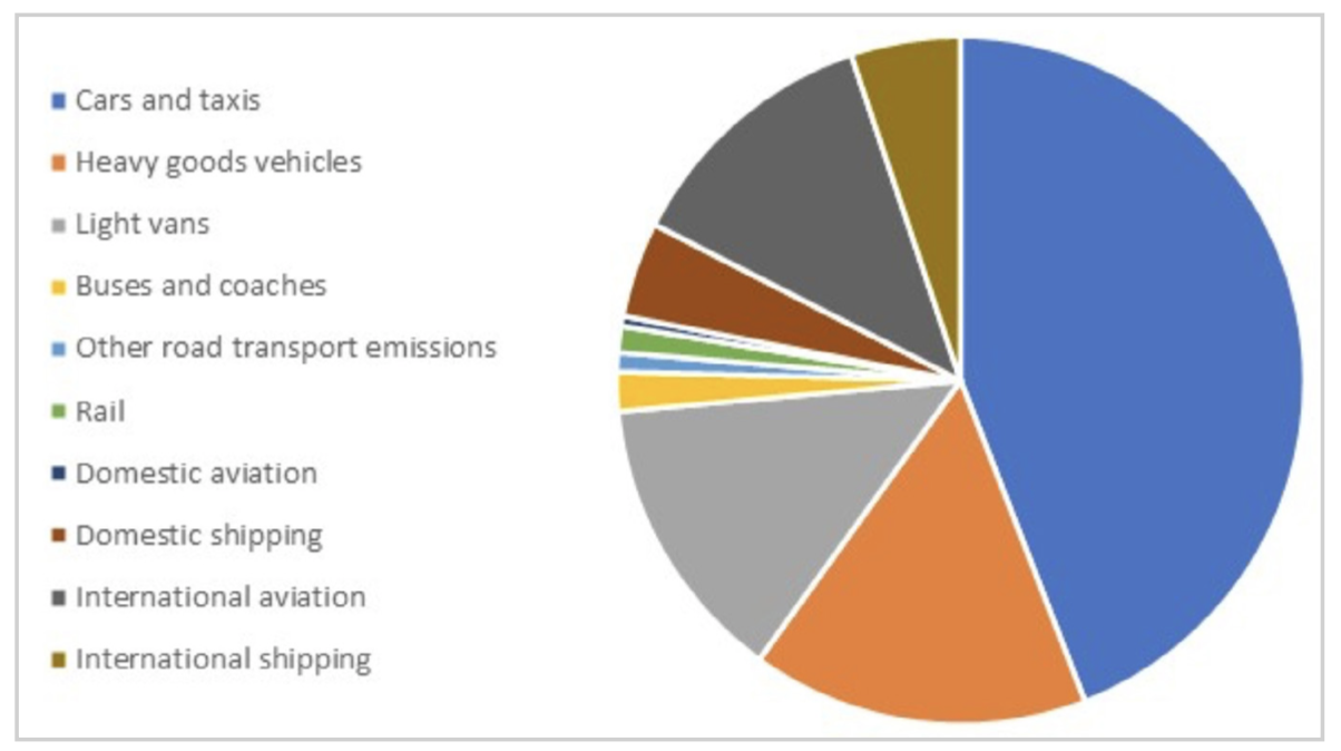
Looking at the source of GHG in 2020 would also give you a misleading picture. A TSGB table shows that over 40% of GHG emissions in that year arose from car traffic, with HGVs and LGVs being the next largest contributors. International aviation came fourth.
However, this is only the case because of the collapse of aviation traffic in 2020.
Regarding the 2021 Census, perhaps the most anticipated information release for those in the transport sector would normally be the travel to work data set, traditionally a key source of information for transport and land use planners. However, with the 2021 Census taking place during the Covid pandemic, while interesting from a historic perspective, the data set is of limited use for understanding changes in transport use and future planning.
It is nonetheless still worth exploring how people moved (or didn’t) to work across the country and how this varied by location during this unprecedented time. At present we only have data for England and Wales, travel to work data has not yet been released for Northern Ireland and the Census in Scotland was delayed till 2022.
Not surprisingly, working from home increased by 20 percentage points or around 6 million people in 2021 compared to the last census in 2011. The number of people commuting by taxi doubled as people avoided public transport. In absolute terms rail use was down most, by 56%, bus use down by 35%, cycling and walking down by 19% and 16% respectively.
While as a proportion of people working, the number of people commuting by car was down by 8 percentage points, the absolute number was down by just 4%, highlighting that over 3 million more people were working in 2021 compared to 2011.
There was a massive difference across the country in relation to the extent people worked from home during the pandemic. The lowest proportion of those working from home were in a mixture of agricultural areas (Lincolnshire being a good example with only 10-16% of workers across the county working from home at the time of the Census), and areas with high levels of deprivation with relatively few office-based jobs.
One point worth examining from the new data is how the car is faring as a mode of travel – and its relative attractiveness.
The phrase “war on motorists” might feel like a new dimension of transport policy but it actually first appears in the British Newspaper Archive in 1902. Under the headline “The war on motorists - a big haul – Scarborough”, a couple of regional papers reported the appearance of five motorists at Scarborough County Police Court to answer to summonses charging them with “having furiously driven their cars to the danger of the public”. That war phrase, implying persecution as well as prosecution, has been used regularly ever since, often in relation to the cost of motoring.
Expenditure on car running costs remained fairly constant for the first ten years of the new Millennium, then steadily fell in part due to the freeze on fuel duty and reducing costs of repairs and servicing as vehicles became more reliable.
The reality, as some data in TSGB illustrates, is rather different. It shows household weekly expenditure in constant prices on car purchase and running costs and public transport fares over the last 20 years. The real cost of purchasing a car almost halved between 2002 and 2013, then rose by around 50% between then and now. However, purchase costs are still markedly down on the level 20 years ago, while the quality and reliability of the product car buyers get for their money has significantly improved.
Expenditure on car running costs remained fairly constant for the first ten years of the new Millennium, then steadily fell in part due to the freeze on fuel duty and reducing costs of repairs and servicing as vehicles became more reliable. Running cost expenditure obviously fell in 2022 (the data is for financial year 2021/2022) due to the impacts of Covid.
In total, average household spend on car purchase and their use peaked in 2004 at £72.50 a week (in today’s prices) and hovered around the £60 mark for the last six years before Covid. Expenditure on public transport has also remained relatively steady over the last 20 years. However, this hides a steady decline in spend on bus fares and a corresponding increase in spend on rail fares. In the light of all this, I think we can safely concur there has been no war on the motorist with regard to the cost of motoring.
TSGB remains a treasure trove of statistical nuggets enabling you to find information on issues as esoteric as: annual expenditure across Great Britain on street lighting (£750m in 2019/20); the continuing high personal cost of fishing, with an average of five deaths a year on UK fishing vessels in UK waters over the last years; to the fact that road vehicles have increased their share of freight traffic by 10 percentage points over the last 15 years all at the expense of shipping.
Browsing data is a different process to going looking for specific stats to address a problem or support a proposition. So maybe better now to treat TSGB as the key to the bigger picture, and a wealth of unexpected insights. Long may it continue to shed light on the ever-changing world of transport.
And in regard to the Census, might the increasing use of mobile phone data to track movement mean that the travel to work data has outlived its usefulness? Should it, and other similar forms of data be removed from future censuses, National Travel Surveys or the London Travel Demand Survey, or do they all still fulfil useful functions in their own ways?
As always, I welcome feedback and suggestions on the world of transport data – both from the traditional sources, and increasing range of new ones.
John Siraut is director of economics at Jacobs.
Four key tables from Transport Statistics Great Britain (TSGB) 2022
Interpreting long-term trends from TSGB is dangerous, given that the most recent data covers the Covid pandemic. For example, greenhouse gas emissions (GHG) from road transport in 2020 were 19% down from 1990. Surely a good news story, but in reality this reduction is purely down to lower levels of travel arising from the impacts of Covid. The 2019 emissions were in fact identical to those in 1990.
Looking at the source of GHG in 2020 would also give you a misleading picture. Figure 1 shows that over 40% of GHG emissions in that year arose from car traffic, with HGVs and LGVs being the next largest contributors. International aviation came fourth.
Figure 1: Proportion of total greenhouse gas emissions by mode 2020
Graph from: https://www.gov.uk/government/statistics/transport-statistics-great-britain-2022
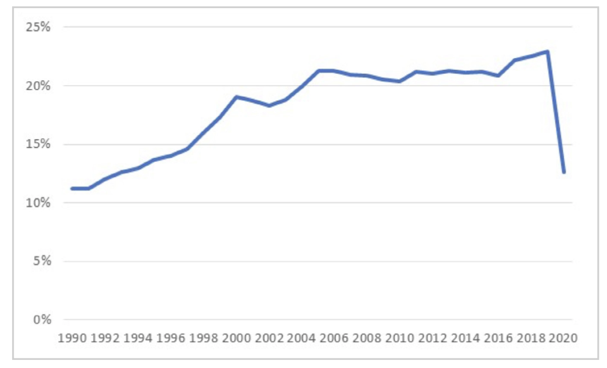
However, this is only the case because of the collapse of aviation traffic in 2020. Figure 2 shows the annual percentage of all transport related GHG emissions that are due to aviation over the last 30 years. Unlike for other modes, aviation related emissions have risen considerably since 1990, both in absolute and relative terms. In 2019, they accounted for 23% of transport-related emissions, having doubled in volume since 1990, and aviation was responsible for more emissions than both HGVs and LGVs.
Figure 2: Proportion of all transport related GHG arising from aviation 1990-2020
Graph from: https://www.gov.uk/government/statistics/transport-statistics-great-britain-2022
This year will see virtually the whole of Greater London covered by an Ultra Low Emission Zone aimed at improving air quality in the region. There have been considerable improvements in emission standards in recent years. For example, PM2.5, that is, airborne particulate matter with an aerodynamic diameter less than 2.5 micrometres, from exhaust emissions has fallen by 83% since 1990. Unfortunately, exhaust emissions are only part of the story. PM2.5 from tyre and brake wear and road abrasion are up by 37% and 34% respectively over the same period as traffic volumes increased. As figure 3 shows, the main source of PM2.5 is now from car tyre and brake wear while total emissions from road abrasion are virtually the same as exhaust emissions. So, while Clean Air Zones and the increased use of electric vehicles have a material positive impact on air quality, on their own they will not fully address pollution arising from vehicle use.
Figure 3: Particulates (PM2.5) - airborne particulate matter with aerodynamic diameter less than 2.5 micrometres by source

Graph from: https://www.gov.uk/government/statistics/transport-statistics-great-britain-2022
Figure 4 shows household weekly expenditure in constant prices on car purchase and running costs and public transport fares over the last 20 years. The real cost of purchasing a car almost halved between 2002 and 2013, then rose by around 50% between then and now. However, purchase costs are still markedly down on the level 20 years ago. Expenditure on car running costs remained fairly constant for the first ten years, then steadily fell in part due to the freeze on fuel duty and reducing costs of repairs and servicing as vehicles became more reliable. Running cost expenditure obviously fell in 2022 (the data is for financial year 2021/2022) due to the impacts of Covid. In total, average household spend on car purchase and their use peaked in 2004 at £72.50 a week (in today’s prices) and has hovered around the £60 mark for the last six years before Covid. Expenditure on public transport has also remained relatively steady over the last 20 years, though this hides a steady decline in spend on bus fares and a corresponding increase in spend on rail fares.
Figure 4: Household expenditure of car purchase and running costs and public transport in 2022 prices

Graph from: https://www.gov.uk/government/statistics/transport-statistics-great-britain-2022
Travel to Work – Census 2021 England & Wales in Eight tables
The release of information from the 2021 Census continues with the travel to work data set. However, with the 2021 Census taking place during the Covid pandemic, the data will be of limited use for understanding underlying longer term changes in transport use and future planning. At present we only have data for England and Wales, travel to work data has not yet been released for Northern Ireland and the Census in Scotland was delayed till 2022.
Figure 1 shows the proportion of people working from home and the main mode of travel for those travelling to work in 2011 and 2021. Not surprisingly, working from home increased by 20 percentage points or around 6 million people in 2021 compared to 2011. The number of people commuting by taxi doubled as people avoided public transport. In absolute terms rail use was down most, by 56%, bus use down by 35%, cycling and walking down by 19% and 16% respectively. While as a proportion of people working, the number of people commuting by car was down by 8 percentage points, the absolute number was down by just 4%, highlighting that over 3 million more people were working in 2021 compared to 2011.
Figure 1: Working from home and main mode for commuting 2011 & 2021

Source: https://www.ons.gov.uk/datasets/TS061/editions/2021/versions/1 and https://www.nomisweb.co.uk/query/construct/submit.asp?forward=yes&menuopt=201&subcomp=
The rest of this article examines the propensity of people, by local authority residence in England and Wales, to travel to work by various modes or work from home.
Cycling
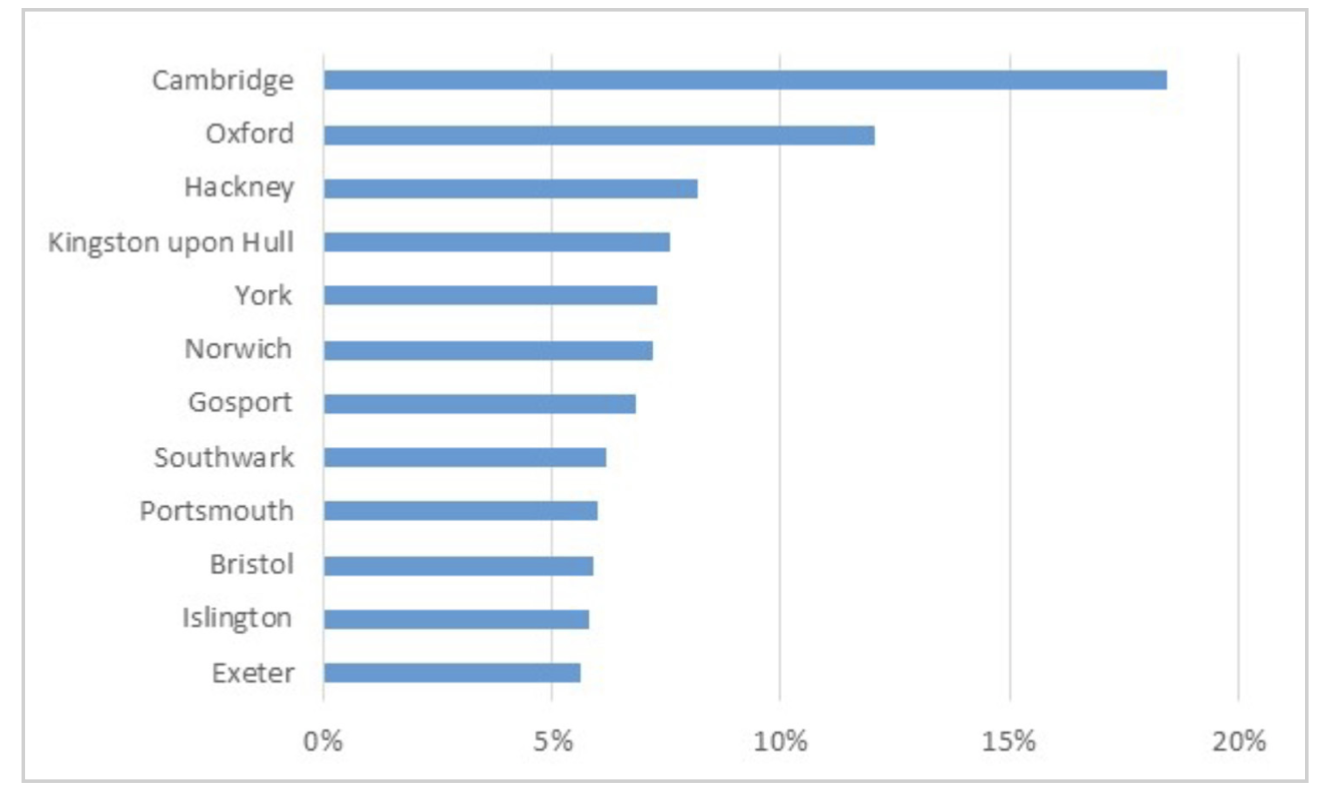
That residents of Cambridge and Oxford have the highest level of cycle commuting is no surprise. While as shown in figure 2, Hackney maintains its reputation as London’s cycling borough. Smaller towns and cities also had relatively high cycling use. At the other end of the scale just 0.1% of workers in Walsall cycled to work. It’s not always clear why some smaller cities and towns achieve higher rates of cycling than others and there would appear to be considerable potential to increase the level of cycling in many locations where the commute to work is relatively short.
Figure 2: Local authority areas with the highest proportion of workers who cycled to work 2021
Source: https://www.ons.gov.uk/datasets/TS061/editions/2021/versions/1
Walking
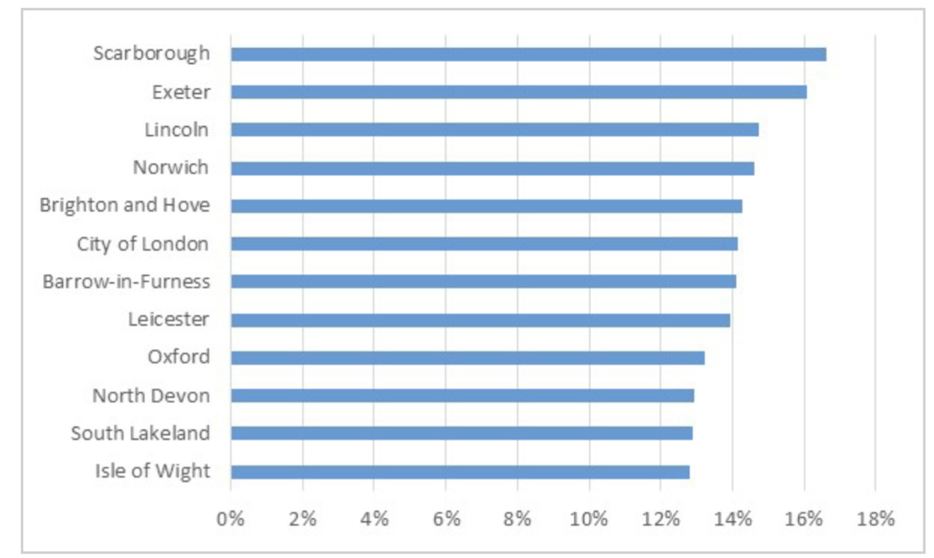
Some of the same locations that have high cycle use also have significant proportions of people walking to work, reflecting the local nature of employment, figure 3. Not unexpectedly London Boroughs and larger cities are not included in figure 3 highlighting that most people in these locations do not live close to their place of work. Bromley, for example, with just 4% of workers walking to work is towards the bottom of the rankings.
Figure 3: Local authority areas with the highest proportion of workers who walked to work 2021
Source: https://www.ons.gov.uk/datasets/TS061/editions/2021/versions/1
Public transport
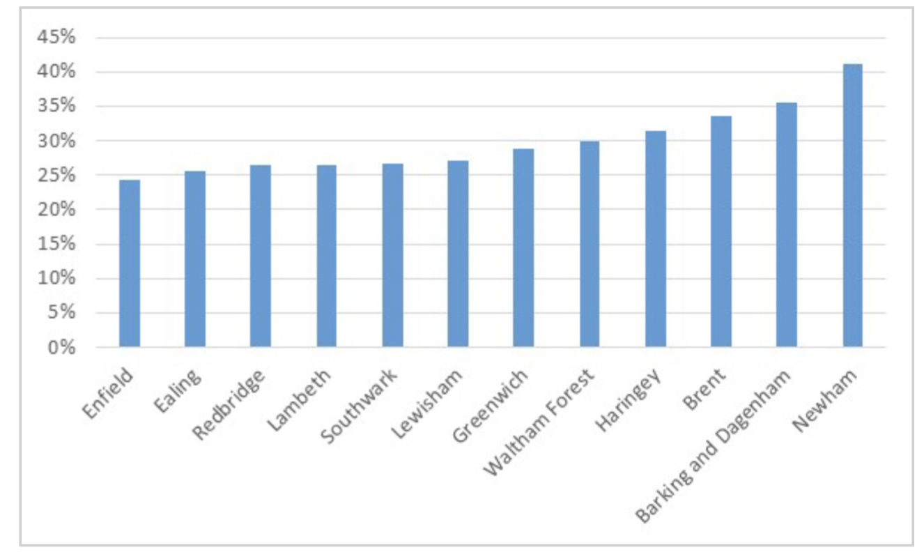
Figure 4 shows that it was London Boroughs that dominated public transport use although it is generally the lower income areas that appear at the top of the ranking, with residents more likely to be employed in jobs that were not possible to do remotely. This also reflects the fact that people living in the typical commuter belt locations that are normally major rail users were in jobs that could be done from home.
Figure 4: Local authority areas with the highest proportion of workers who used public transport to travel to work 2021
Source: https://www.ons.gov.uk/datasets/TS061/editions/2021/versions/1
Working from home
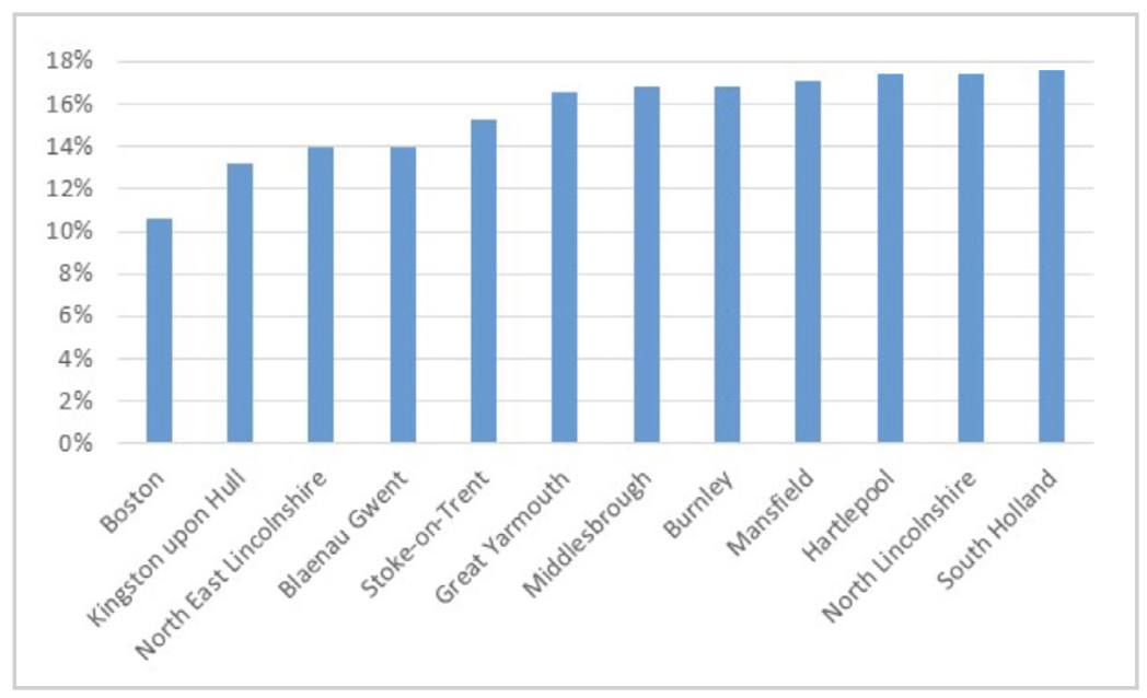
There was a massive difference across the country in relation to the extent people worked from home. Figure 5 shows those areas where the lowest proportion of workers worked from home. They are a mixture of agricultural areas (Lincolnshire being a good example with only 10-16% of workers across the county working from home at the time of the Census) and areas with high levels of deprivation with relatively few office-based jobs.
Figure 5: Local authority areas with the lowest proportion of workers who worked from home 2021
Source: https://www.ons.gov.uk/datasets/TS061/editions/2021/versions/1
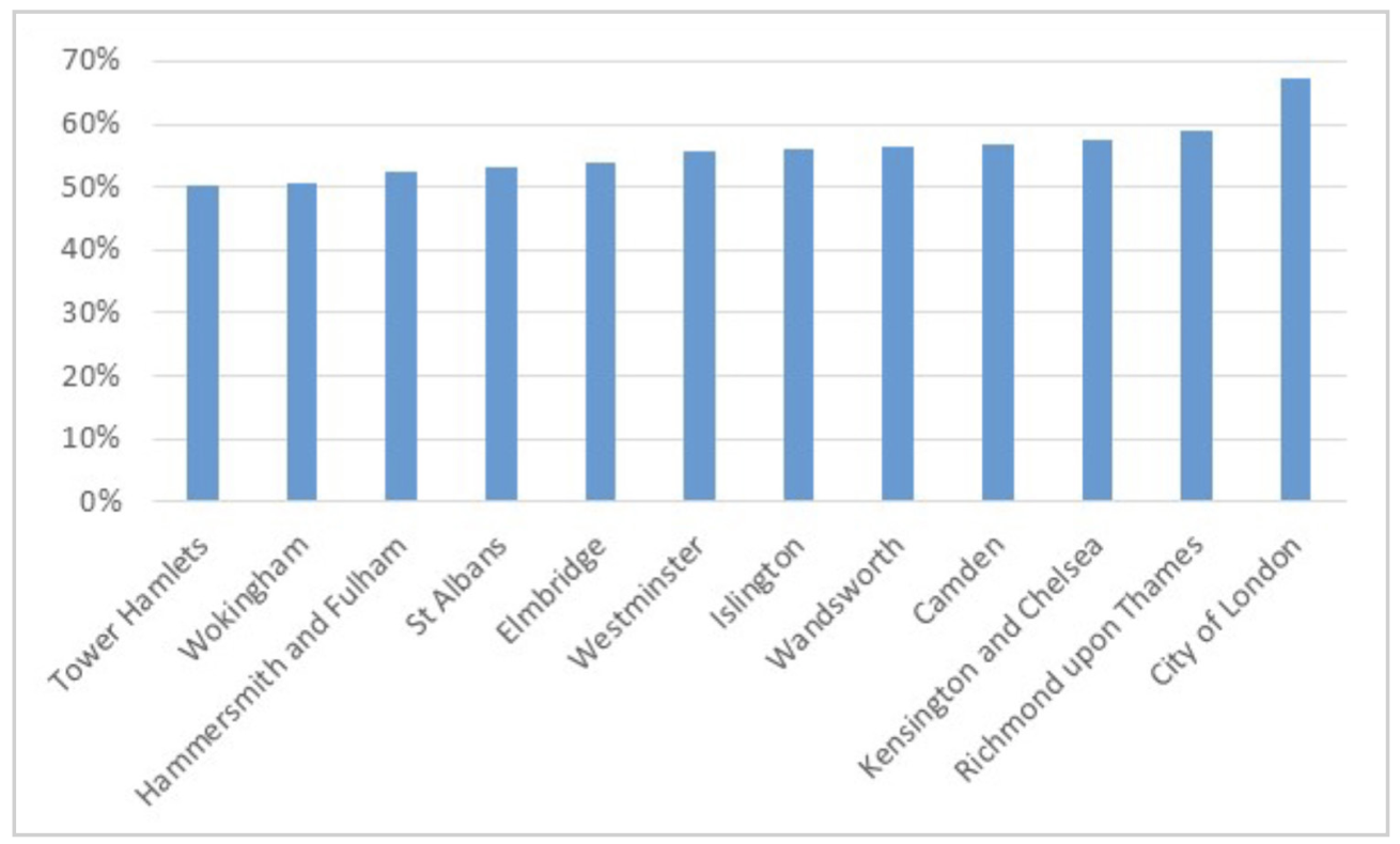
At the other end of the scale are mainly London Boroughs and commuter belt locations which saw 50-60% of workers working from home, figure 6. The nature of these areas contrasts with the London Boroughs appearing in figure 4 and highlights the very different characteristics of London Boroughs. In contrast Leeds saw 34% of its workers working from home, Manchester 32% and Birmingham just 26%.
Figure 6: Local authority areas with the highest proportion of workers who worked from home 2021
Source: https://www.ons.gov.uk/datasets/TS061/editions/2021/versions/1
Car use
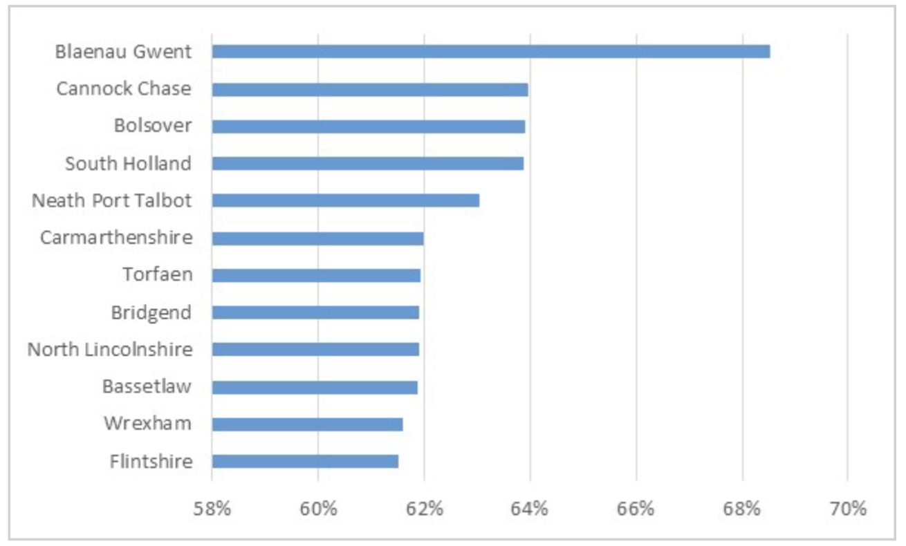
Finally those who continued to travel to their place of work were more likely to drive and the areas with the highest car use were predominately rural in nature where there were few alternatives available. As can be seen in figure 7 locations in Wales are well represented.
Figure 7: Local authority areas with the highest proportion of workers who travelled to work by car 2021
Source: https://www.ons.gov.uk/datasets/TS061/editions/2021/versions/1
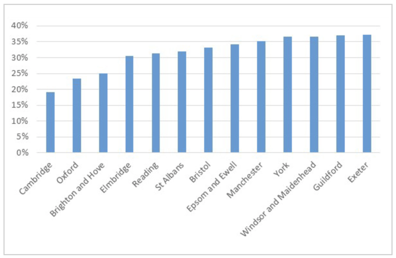
Outside London those areas with the lowest car use are shown in figure 8. They are a mixture of areas with high levels of sustainable transport use, for example, Cambridge, Oxford and Brighton and those with high levels of home working, for example, Elmbridge and St Albans.
Figure 8: Local authority areas with the highest proportion of workers who travelled to work by car 2021
Source: https://www.ons.gov.uk/datasets/TS061/editions/2021/versions/1
Other modes
Plymouth recorded the highest motorcycle use at 1.3%, while residents of lower income areas such as Middlesborough, Stoke and Blackburn with lower car ownership were the most likely to use taxis which were used by 3-4% of workers.
John Siraut is director of economics at Jacobs.
This article was first published in LTT magazine, LTT860, 10 January 2023.
You are currently viewing this page as TAPAS Taster user.
To read and make comments on this article you need to register for free as TAPAS Select user and log in.

Log in