TAPAS.network | 6 March 2023 | Commentary | John Siraut
Buses: data reveals an unstable and challenging landscape

Tracking bus use has been a significant part of monitoring the impacts of the pandemic, but also the continuing long-term decline in the sector. examines the latest annual bus statistics and finds a number of significant regional and local differences, including in the levels of dependence on public funding. He also looks at the amount of concessionary bus travel, the change in fare levels and in drivers wages over the last twenty years.
THE LATEST annual bus statistics for Great Britain for the financial year 2021/22 were published at the end of January. They provide information at a regional level, and for England only at a local authority level, across a range of indicators. Travel was obviously badly impacted by COVID in this period so, rather than examining the absolute numbers, this article looks more at comparisons between localities including how they have fared over the period 2018/19 to 2021/22 and at some longer term trends.
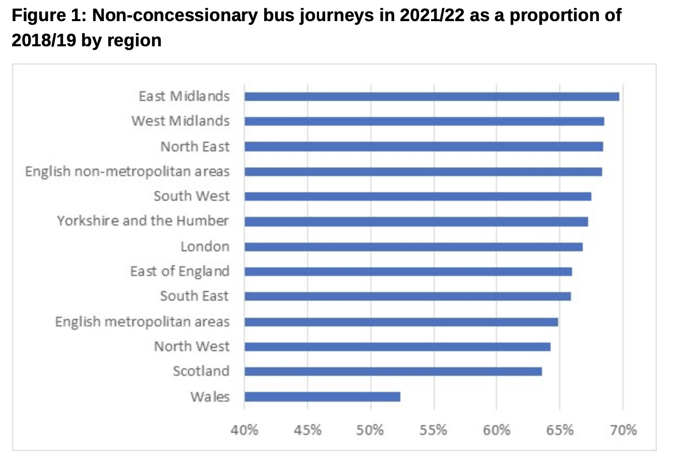
Non-concessionary bus travel in 2021/22 was broadly at two-thirds of the pre-pandemic level in 2018/19, the clear outlier as shown in figure 1 being Wales, where it was just 52%.
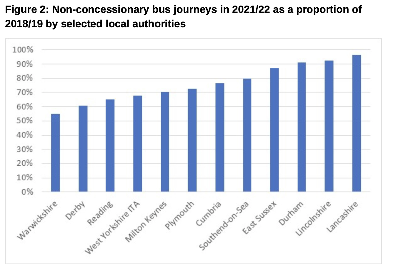
At English local authority level the variations are much greater. Figure 2 shows the level of non-concessionary travel in 2021/22 as a proportion of 2018/19 for selected local authorities. Lancashire was the best performing area, with passenger numbers at 96% of pre-COVID levels. Lincolnshire, which is one of those areas that saw exceptionally low levels of working from home during the pandemic, also achieved non-concessionary passenger numbers at over 90% of 2018-19 levels. At the other end of the scale passenger numbers were just 55% of pre-COVID levels in Warwickshire. Recovery of passenger numbers has tended to be lower in higher income areas with high levels of home working and greater use of online shopping.
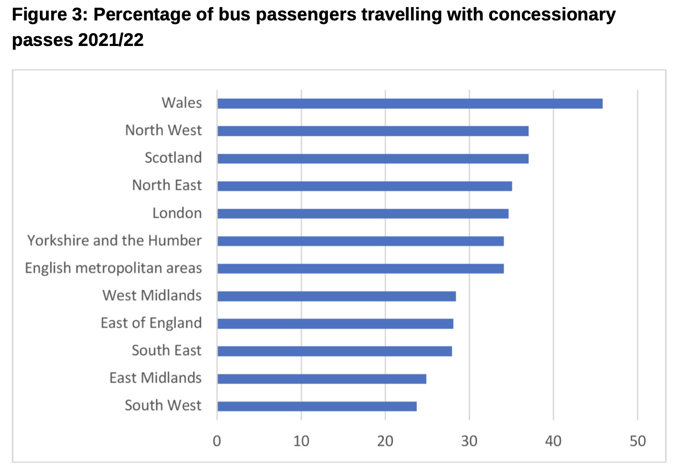
Across Great Britain as a whole, a third of all bus journeys are made by non-fare paying adults, i.e. concessionary pass holders. This varies from just 24% in the South West to 46% in Wales as shown in figure 3.
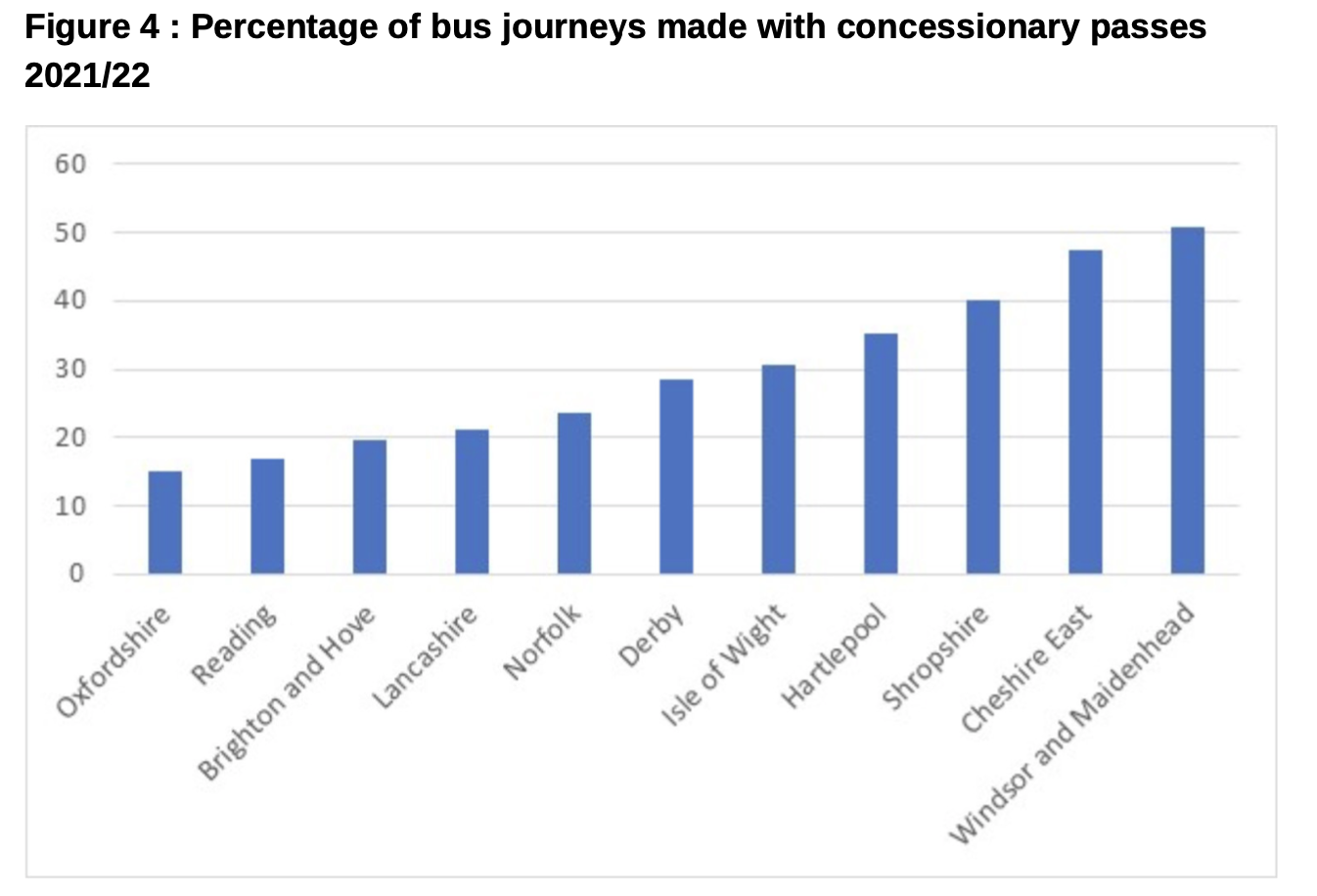
At a local authority level the variation is even more stark with over 50% of passengers in Windsor & Maidenhead travelling on a concessionary pass, compared to just 15% in Oxfordshire as shown in figure 4. Areas with a lower proportion of concessionary pass use tend to be those with either a better level of bus service, which attracts a wider range of general users, or lower income areas with lower levels of car ownership. There are, however, always exceptions to this, for example, Hartlepool has a higher than average proportion of concessionary pass users despite being a lower income area.
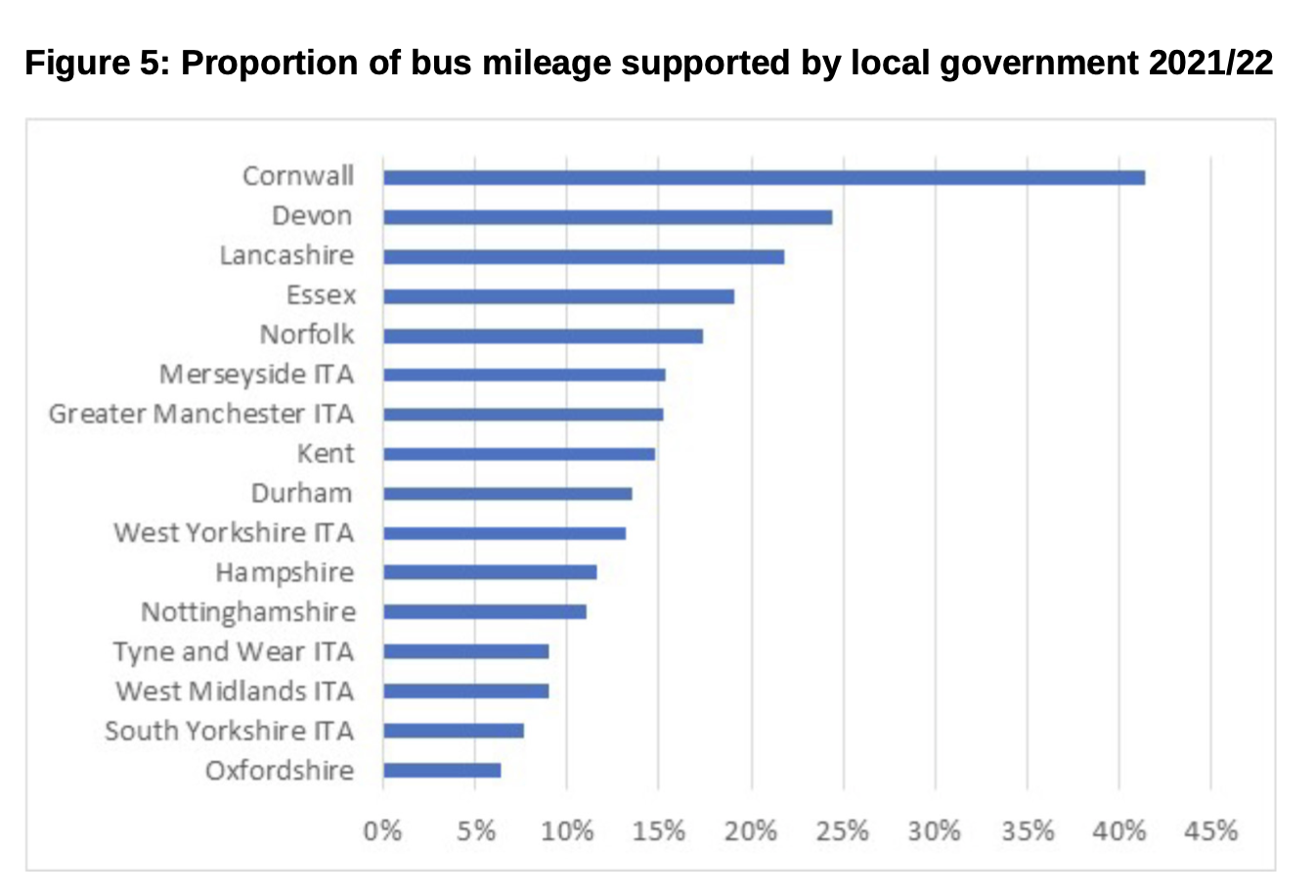
The proportion of the local bus network that is financially supported by local authorities varies considerably - from 0% on the Isle of Wight and in Portsmouth, to 53% in Shropshire. Figure 5 shows the proportion of mileage supported in those local authorities with the largest bus networks in terms of mileage. It is probably no surprise that Cornwall and Devon have such a high proportion of their networks supported. However, there are large variations between the metropolitan areas, with Merseyside and Greater Manchester supporting 15% of their networks compared to just 7% in South Yorkshire.
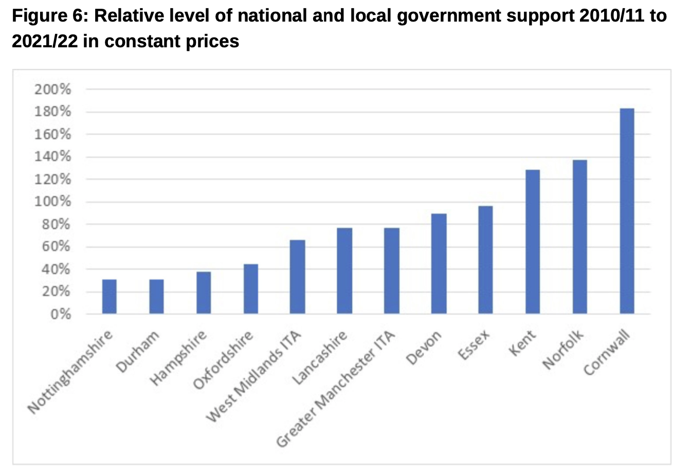
The variation in the level of network support reflects changes in the level of national and local government support for bus services by local authority area. Figure 6 shows for the same local authorities as figure 5 (where data is available) the change in the level of national and local government funding provided over the ten years between 2010/11 to 2021/22 in constant prices. While the level of support for bus services in Cornwall has nearly doubled, in most other areas it has fallen, by over two-thirds in the case of Nottinghamshire and Durham.
This overall reduction in funding has led to significant increases in real fares over the last 20-years. As can be seen in figure 7, fares in the English metropolitan areas rose by over 60% in real terms between 2000 and 2021. Scotland saw the smallest increases, with fares rising by 30% over the same period. The reduction in real fares in 2022 is in part due to significant increases in underlying inflation which that was not fully reflected in fare increases.
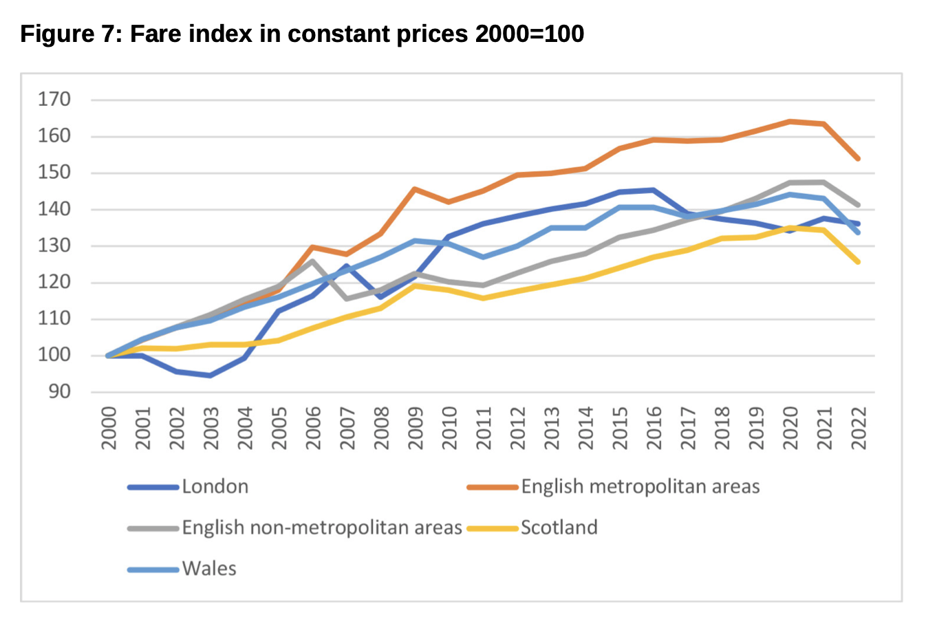
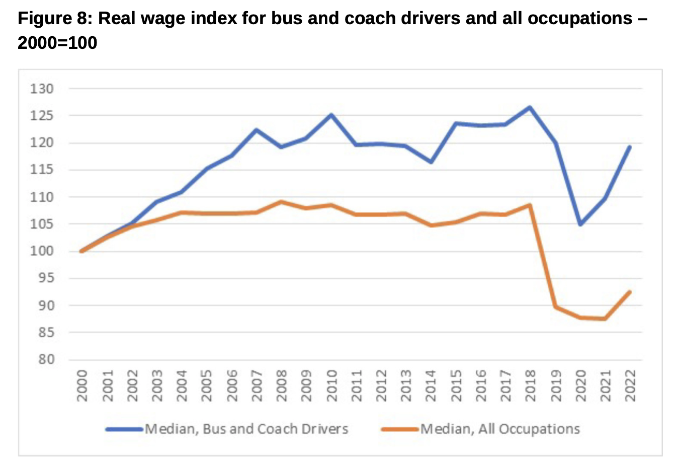
Figure 8 shows that employee earnings in the sector rose strongly in the first part of the decade due to a shortage of drivers meaning operators had to increase real wage levels. They rose over 20% in real terms between 2000 and 2007, while they were relatively flat in the rest of the economy. However, they then stagnated and in 2022 wage levels for bus and coach drivers were less in real terms than in 2007, although they out performed earnings in general.
The bus industry has continued its long-term steady decline in most parts of the country over the past two decades. The bus sector is often overlooked by decision makers and the media, compared to the rail sector, despite it carrying far more passengers every day, it is difficult to see what will turn round its fortunes post-COVID, from which its recovery has lagged that in private motoring, requiring continued injections of government support, the latest only last month. The £2 maximum fare project seems to have had some effect - at least in marketing terms - but it is not clear which combination of price, extent of provision, service quality and pressures placed on other modes to influence their relative attractiveness could make a real difference.
There is some evidence that local social and economic conditions and patterns of activity are the only influence that has made a significant impact on usage levels, with certain areas seeming to be more fertile territory to attract bus use. Against this background, monitoring of the sector’s performance is set to become more difficult now that the Department for Transport has ceased to publish its quarterly bus passenger journey estimates. There is already a relative dearth of bus travel data compared with that for rail.
Sources: The data reviewed in this article and the charts can be found at https://www.gov.uk/government/collections/bus-statistics
John Siraut is director of economics at Jacobs.
This article was first published in LTT magazine, LTT864, 6 March 2023.
You are currently viewing this page as TAPAS Taster user.
To read and make comments on this article you need to register for free as TAPAS Select user and log in.
Log in