TAPAS.network | 29 April 2022 | Commentary | John Siraut
Cars, trains, buses and flights: How much do we all spend on transport?

Some fascinating figures are revealed by a look at the transport elements of the ONS weekly Household Spending survey- both the balance of different modal categories, and the change over time. here examines the data, and what it tells us about the differences across incomes and age distribution.
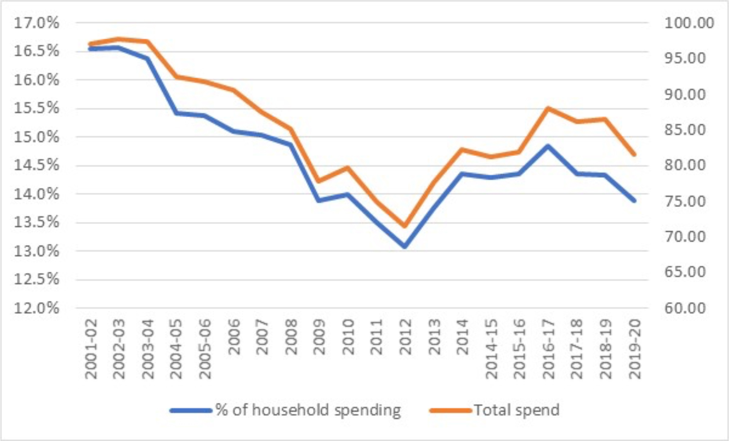
THE OFFICE FOR NATIONAL STATISTICS household spending survey provides a detailed snapshot of our spending habits. Figure 1 shows total weekly spending on transport over the last 20 years and as a percentage of total spending. Over that 20-year period, total household expenditure has remained relatively stable. However, the amount spent on transport declined steadily, mainly due to the reducing cost of cars, from nearly £100 a week at the beginning of the Millennium, reaching a low point in 2012 of £71.70. It has risen since then but remains about 20% below its peak. As a percentage of total household spending it has fallen from a high of 17% in 2001 down to 14% now.
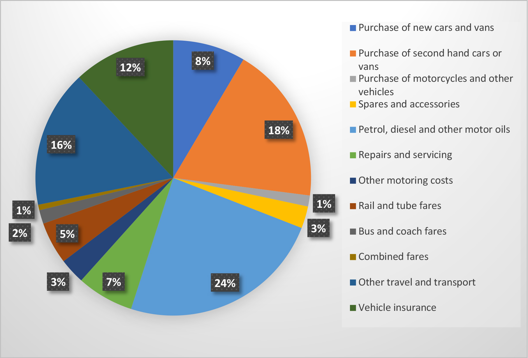
As figure 2 shows, motor fuel accounts for the largest proportion of weekly transport spending (24%), followed by the purchase of second-hand cars at (18%) which is perhaps surprisingly around twice as much as is spent on the purchase of new cars. Vehicle insurance is also a significant cost, accounting for 12% of transport spend. Public transport on the other hand comes out at just 8% of weekly total transport spending.
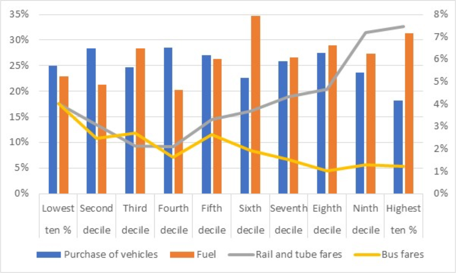
The average household spend data hides a number of variations when income and age are taken into consideration. Figure 3 shows the percentage of household transport budget spent on; car purchase, fuel, rail and bus fares by household income decile. There are some clear and not surprising trends in the data in relation to public transport. Lower income households spend a higher proportion of their transport budgets on buses, although at just 4% it is still very low. This proportion falls to just 1% for the highest income group. While the proportion of household income spent on rail fares starts to fall as income rises but then rises steeply for the highest income households. However, in aggregate the proportion of household spending on public transport for the highest income households, at 8%, is broadly the same as the lowest income ones. With regard to motoring costs, the highest income groups while spending the highest in absolute terms on purchasing vehicles, as a percentage of total transport expenditure they spend the least. For them, fuel costs which account for over 30% of their transport costs is the largest single item. It is notable that higher income households spend more on fuel than car purchase while for lower income households it tends to be the other way round.
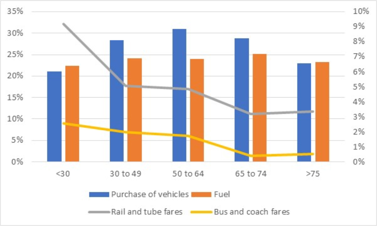
The spending patterns based on age are different again. As table 4 shows, the under 30s spend a higher proportion (and in absolute terms) of their transport budget on public transport, especially rail fares. Vehicle insurance is also a higher cost for this age group than all other age groups.
Motoring expenditure mainly relates to the purchase of vehicles except for the oldest and youngest age groups where fuel accounts for more of their budget.
The average household now spends more on air fares (excluding the air fare component of package holidays) than on public transport. Whilst motoring costs account for the vast majority of all households’ transport budgets regardless of income or age.
Statistics available from the ONS Data Set Family spending workbook 1: detailed expenditure and trends.
John Siraut is director of economics at Jacobs.
This article was first published in LTT magazine, LTT844, 29 April 2022.
You are currently viewing this page as TAPAS Taster user.
To read and make comments on this article you need to register for free as TAPAS Select user and log in.
Log in